Partsrådet - UX strategy and design
Project:
Unifying & simplifying a key governmental website
A gentle reminder for those who forget about the joys of life.
The Social Partners' Council (Partsrådet) is a non-profit organisation funded by state agencies in cooperation with unions. Their mission is to support social partners in the workplaces for the Swedish government sector, consisting of about 250 agencies and organisations.

01 - Role & responsibilities
As UX lead on the project, I worked from the very first strategical steps within the organisation until the website implementation phase. During a 5-month period, I worked closely with all different parts of Partsrådet, breaking the different silos within and helping them streamline, organise and simplify their content. This was done through workshops and interviews, together with weekly meetings to test concepts and ideas.
On top of UX skills, the role needed full proficiency in the Swedish language in order to communicate at best with both users and internal parties of the agency.
02 - Process
The project started with a deep-dive into the organisation: what is Partsrådet, what is it that they actually offer, how do they work amongst themselves? These are only some of the questions that I needed to tackle in order to grasp the entity of the project.
Being a governmental site, the work was particularly challenging in terms of language, content, and internal politics.
During the first emphatise & define phases I performed:
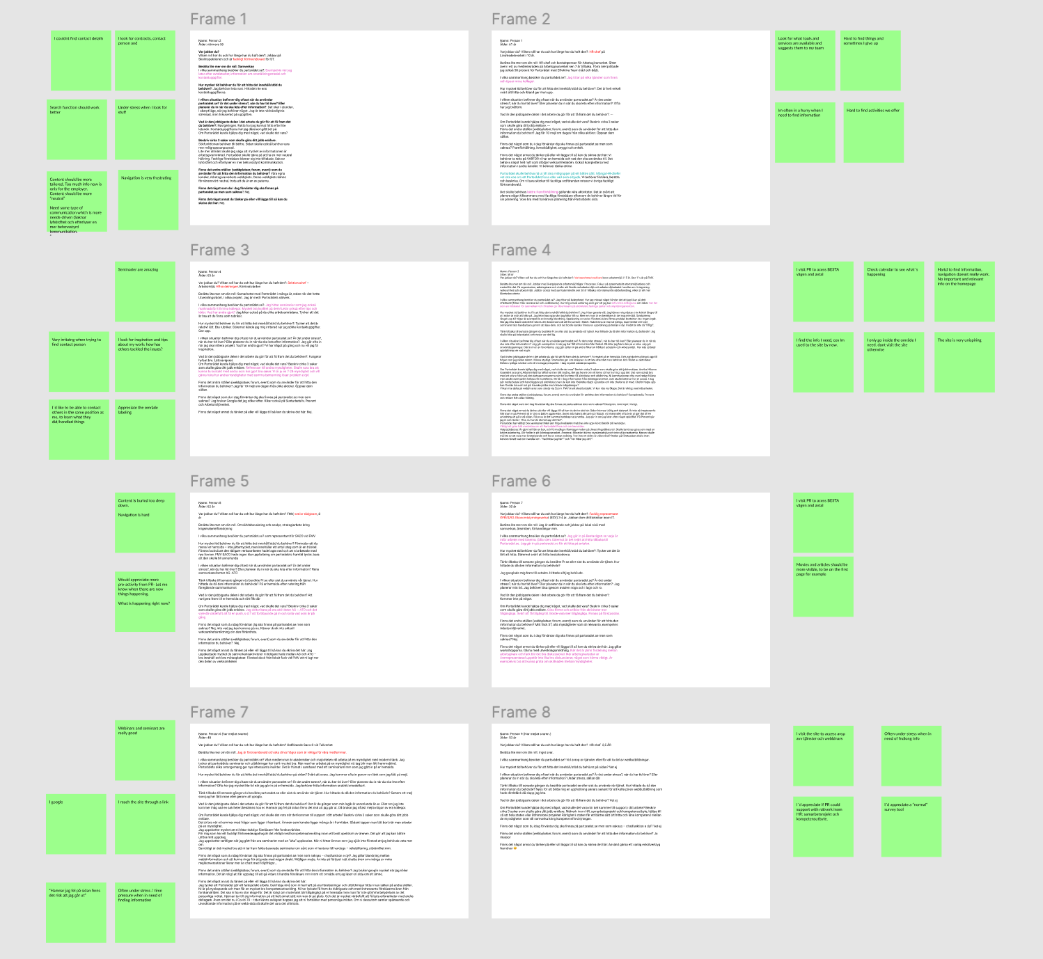
・user interviews
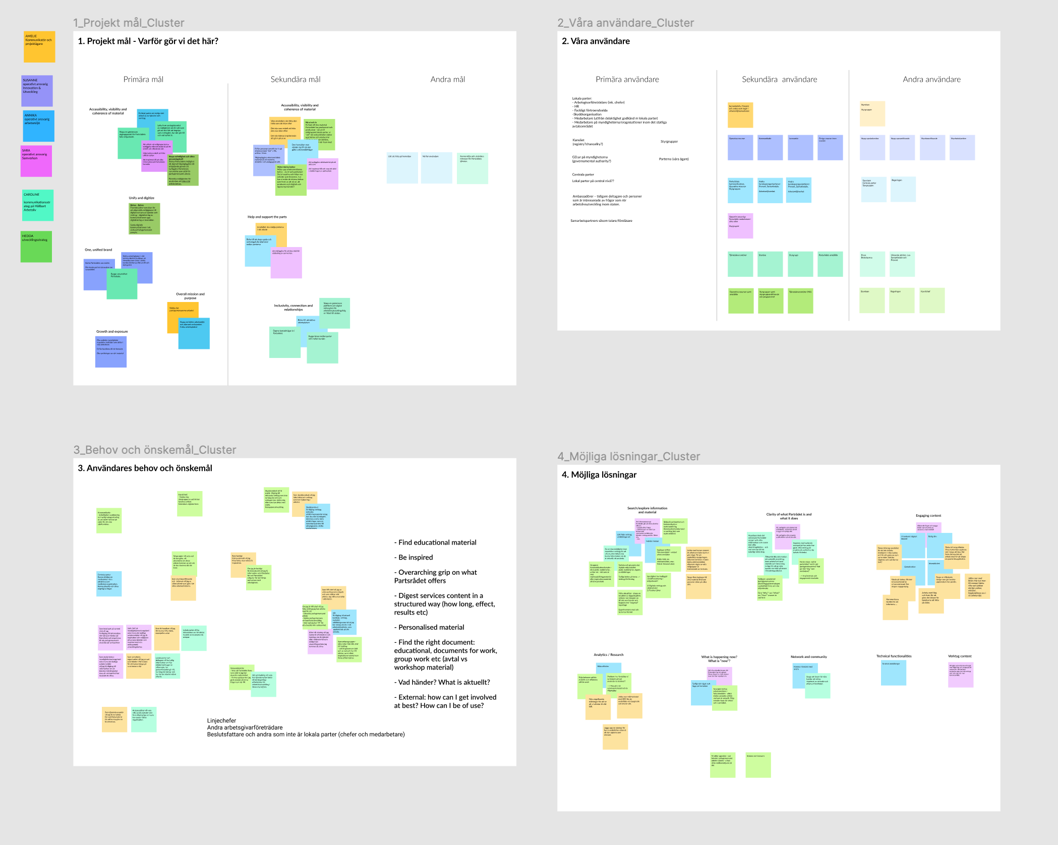
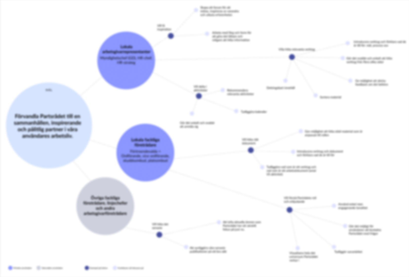
・effect mapping workshops
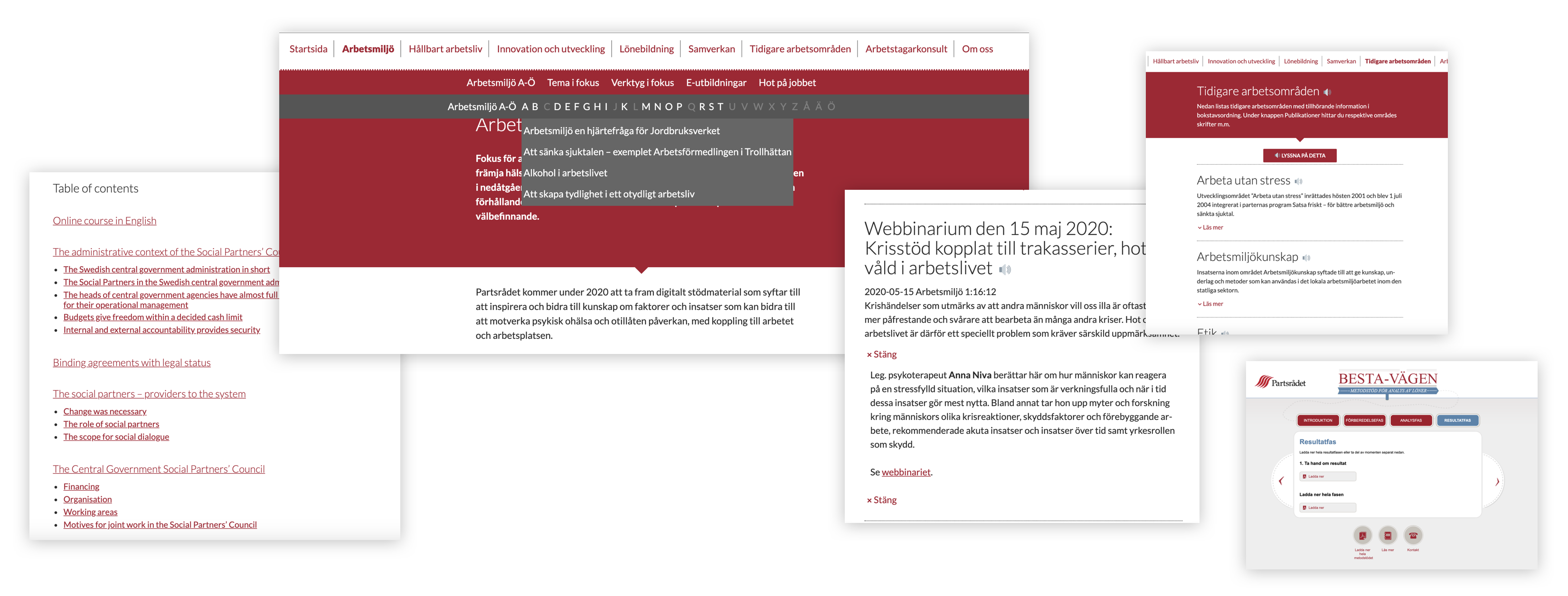
・site audit
Below are some screenshots taken from the initial phase. Due to the pandemic, all workshops and interviews have been carried out remotely.
- IDEATING AND CREATING OPPORTUNITIES
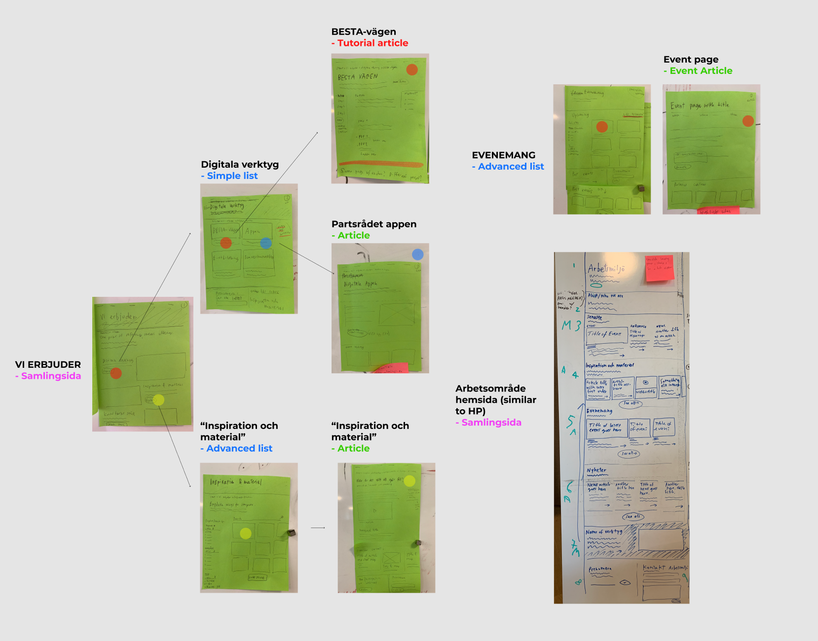
In this second phase I worked with different stakeholders needs, formulating the groundwork for the new website: the old version had clear navigation and usability issues, along several content challenges.
With both users and stakeholders needs in mind, I created a new sitemap, navigation and content structure, working on both hierarchy and taxonomy.
Examples show sitemap and some early low-fi wireframes.

- PUTTING ALL PIECES TOGETHER
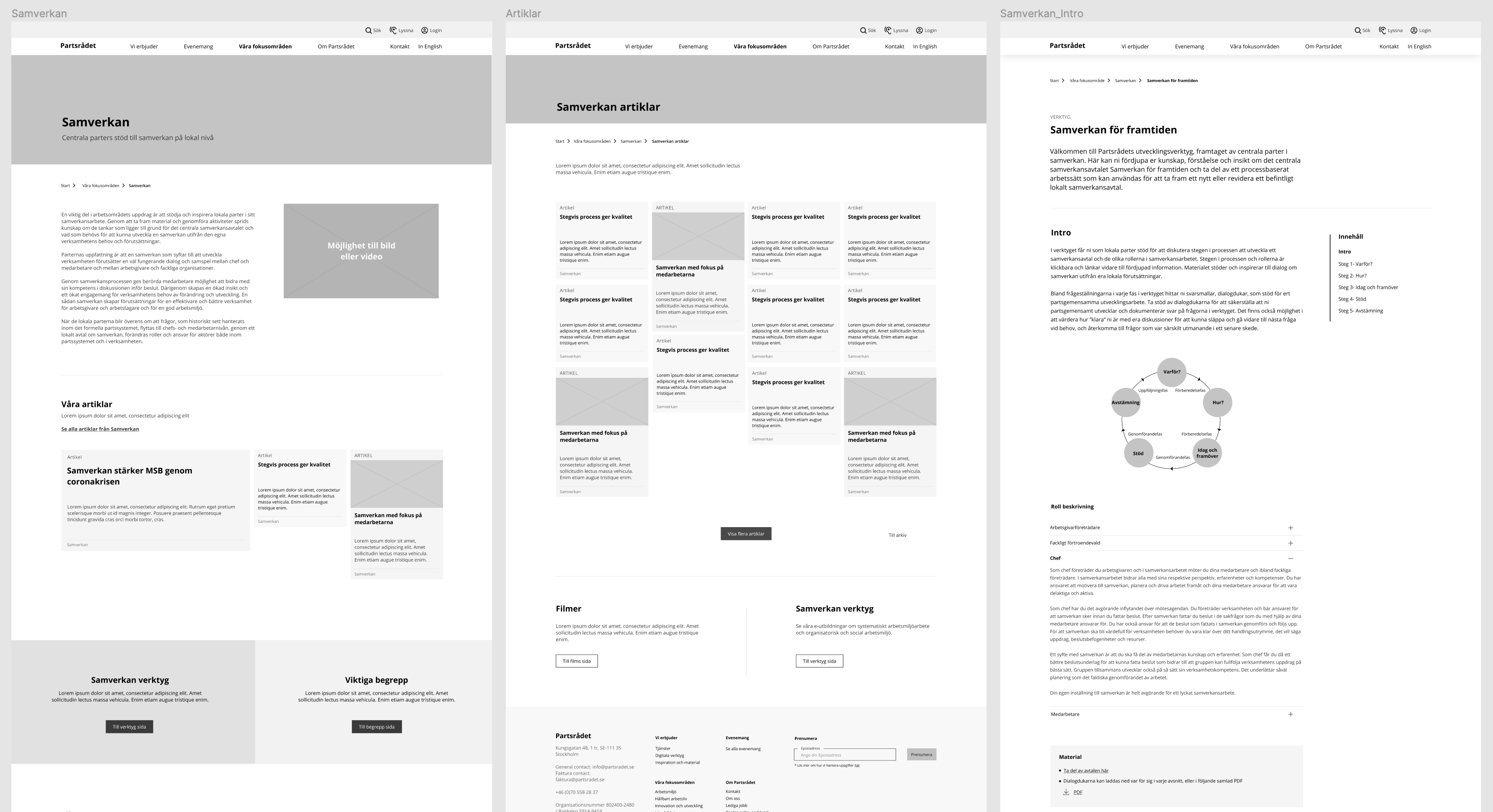
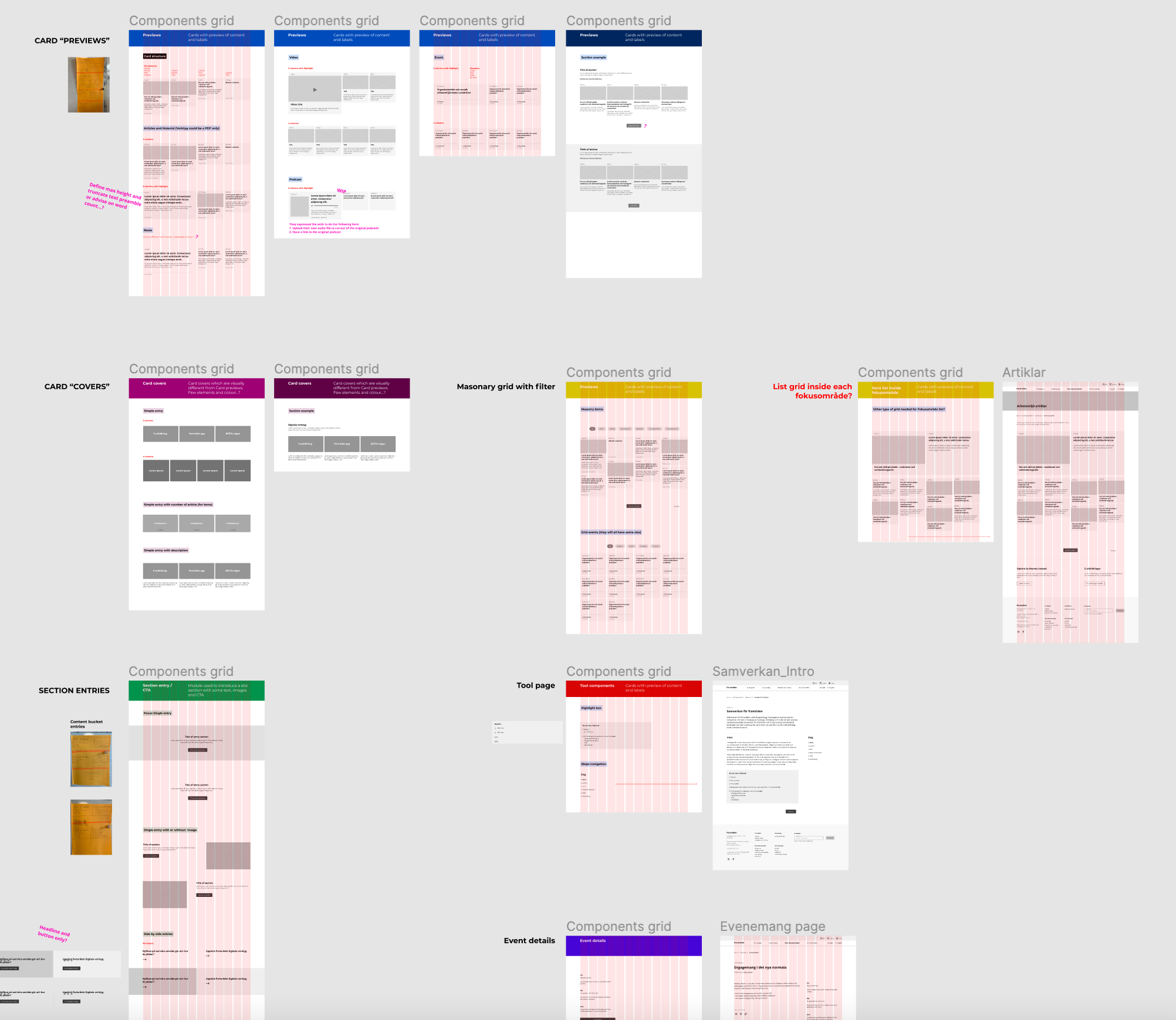
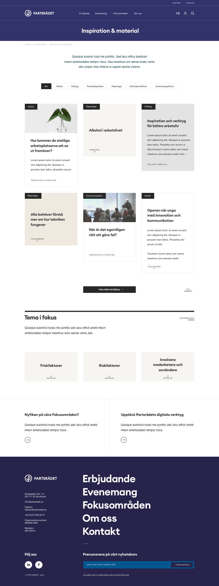
In this last phase I worked on the wireframes and interaction flows of most of the site. This was done in an iterative way, testing prototypes with both clients and selected users.
Working collaboratively with developers, I also created all main components and systems.
03 - Result
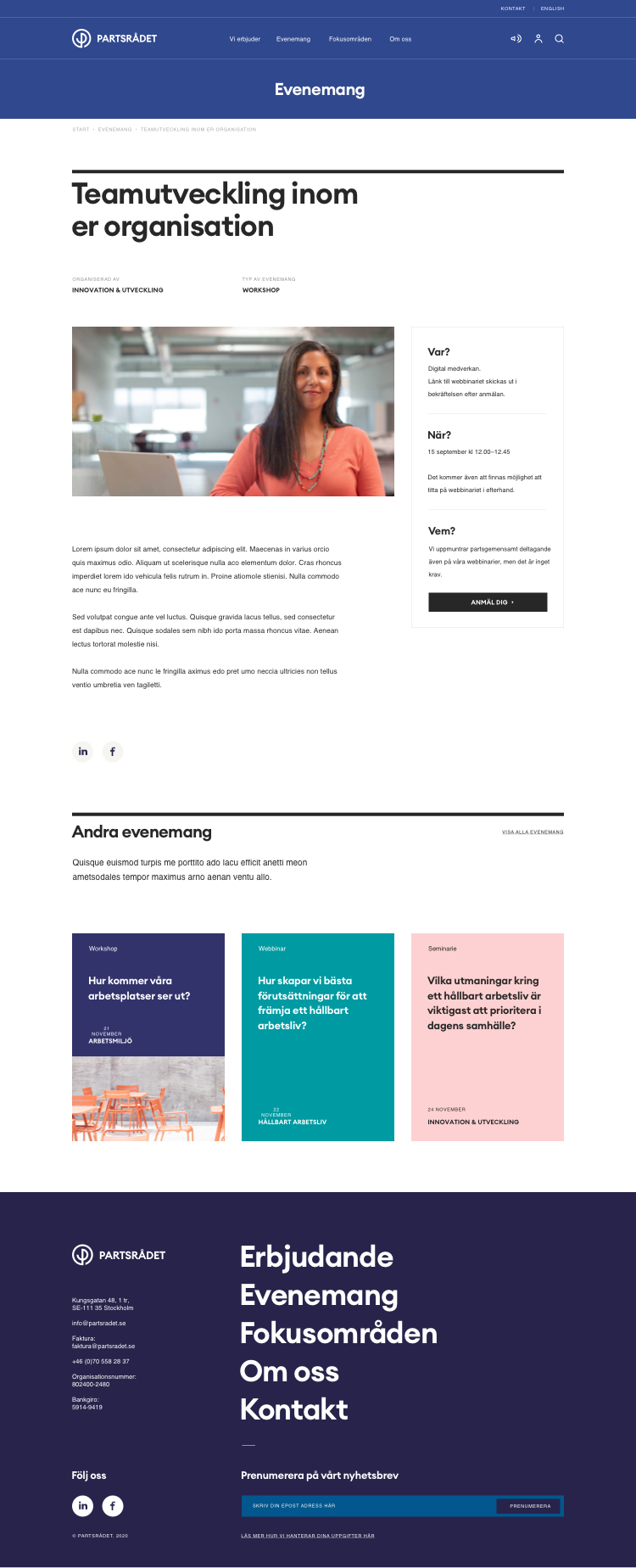
The new website has been proven to be clearer and easier to use, and the added new brand identity tied the project together. Offerings, content and contacts are quickly available in an inspiring way, giving a completely new experience.
Visit the site here.

OTHER PROJECTS
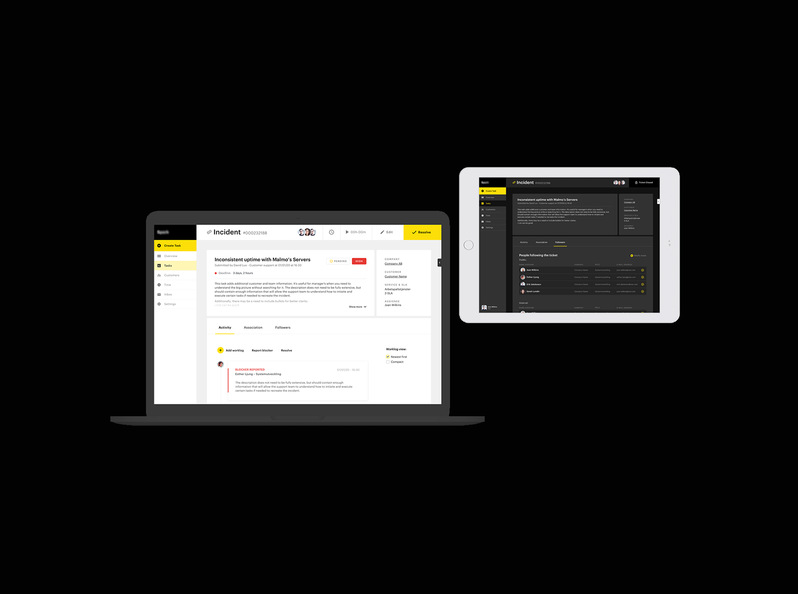
Ticketing support systemProduct design
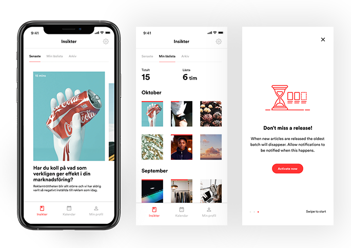
SA appProduct design
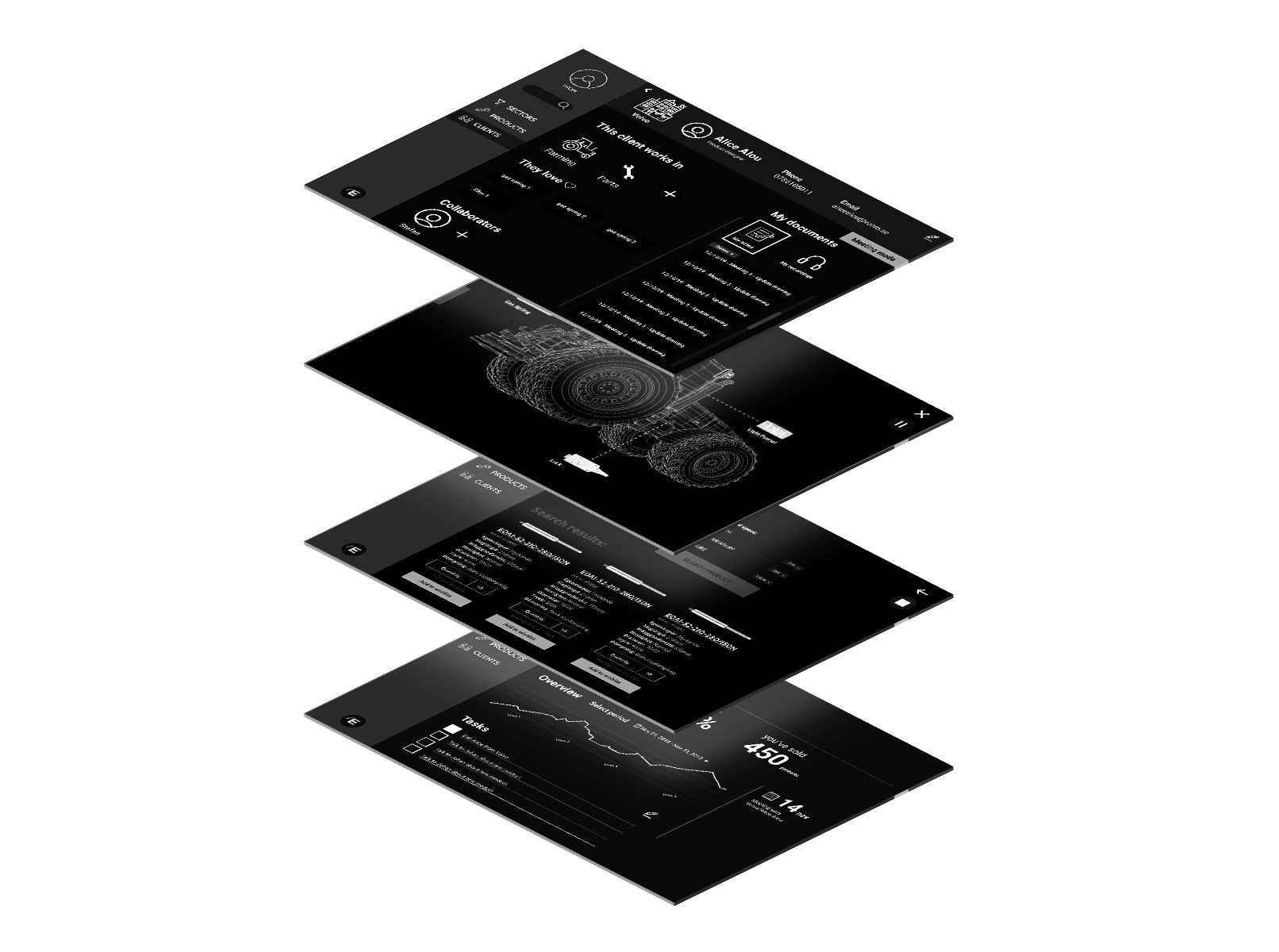
EigenbrodtUX design
ShapesUX design
ArchivePast design projects
A work in progress site built with love and occasional anxiety.
A work in progress site built with love and occasional anxiety.
Get in touch:michela.monterosso@gmail.com