Sveriges Annonsörer - Product design
Project:
Marketing and advertisement insights on the go
A gentle reminder for those who forget about the joys of life.
Sveriges Annonsörer is Sweden's leading and oldest organisation supporting advertisers and marketeers. Their mission is to enable thousands of members to be more successful and effective in their roles, by offering specialised content, events and seminars.
01 - Role & responsibilities
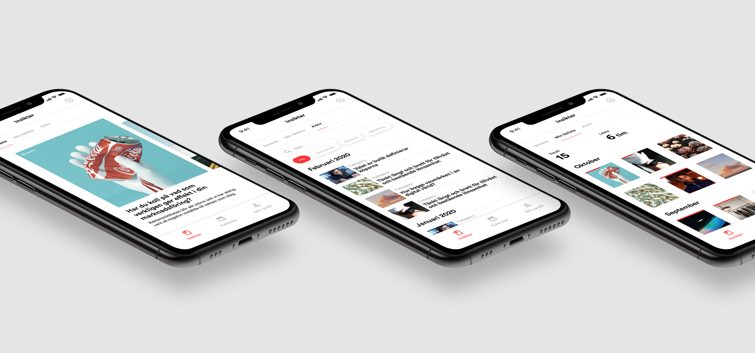
The app was developed with a small and tight team of two developers and two designers. As one of the designers, I worked on the overall UX of the app, structuring content and flows. I also worked on the UI of most screens, together with the visual designer.
01 - Role & responsibilities
I started working on this project as UX designer after the definition phase. My tasks have been focused on implementing the findings done at this earlier stage, by creating wireframes that could reflect at best the user and the client's needs. I have also worked extensively on content structure, bridging the brand principles and tone of voice into the digital experience.
02 - Process
- KNOWLEDGE GATHERING
I firstly absorbed myself in an in-depth service study previously done for this client. Reasons for the app to exist, perks and some main features were highlighted in the study, which was the result of extensive research work with several members of Sverige Annonsörer. My goal in this initial phase was to understand the needs of the users and how to tie them to concrete features in the app.
During the empathise phase, key principles emerged for the target users, and these were the base for the design exploration:
・relevant
・convenient
・gamified
・personalised
- FINDING FOCUS
With the study as background, I moved into synthesizing the findings and ideas, piecing pieces together in order to find meaningful directions to focus on. This definition phase revolved around "how might we" questions such as:
・How might we make articles more available to users?
・In what ways can be reading articles become a fun, learning activity?
・How might we improve the event booking experience?
- BRIDGING INSIGHTS INTO FEATURES
Once gathered in our collective direction, the team collaborated with the client and decided to move forward with 3 solid features for the first release. These are the first features we decided to ideate with:
Articles screen
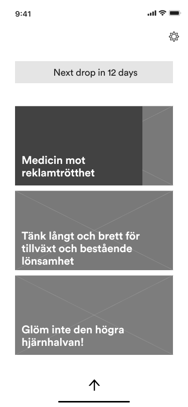
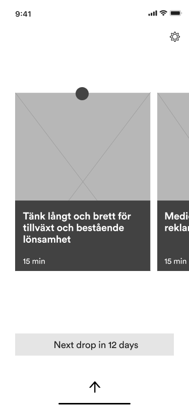
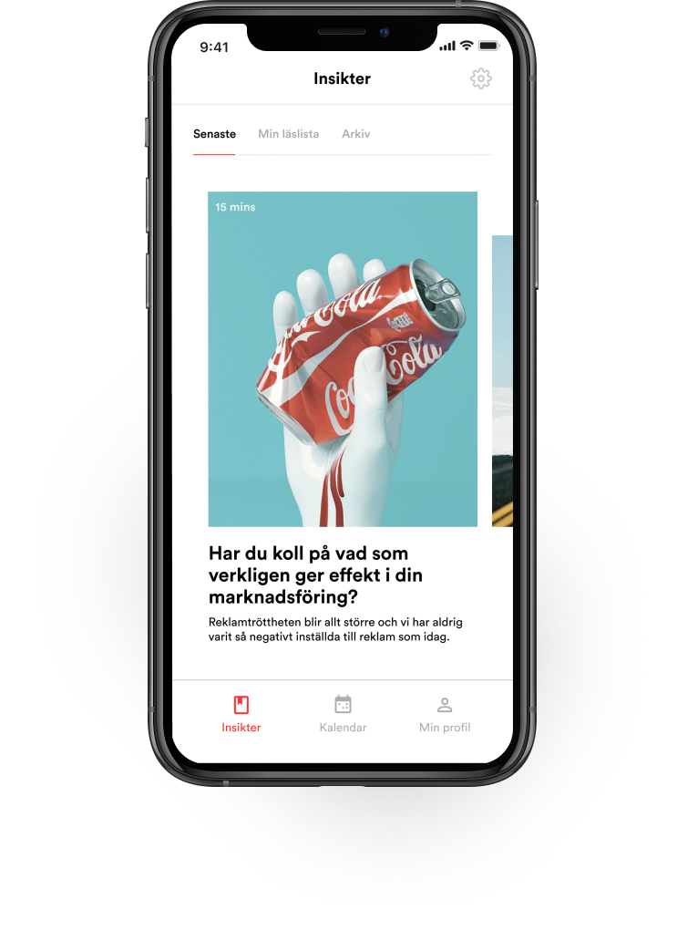
Articles are released twice a month and this screen shows only the latest release. This is to keep the user focused on the newest content.
User reading habits
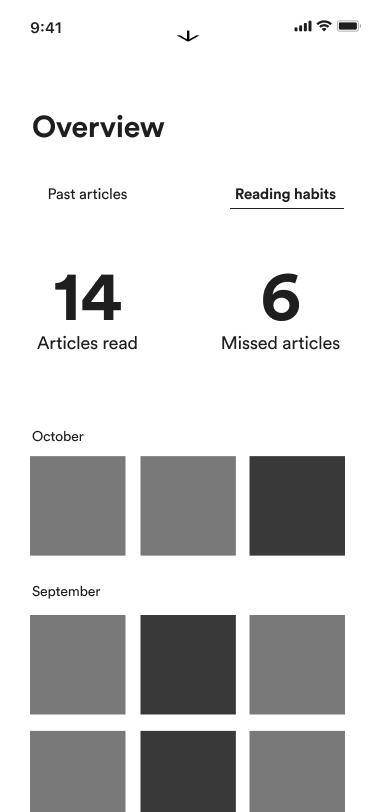
As an incentive to keep up to date with the market, the user can quickly see how many articles they have read and how far they have read them.
Event booking
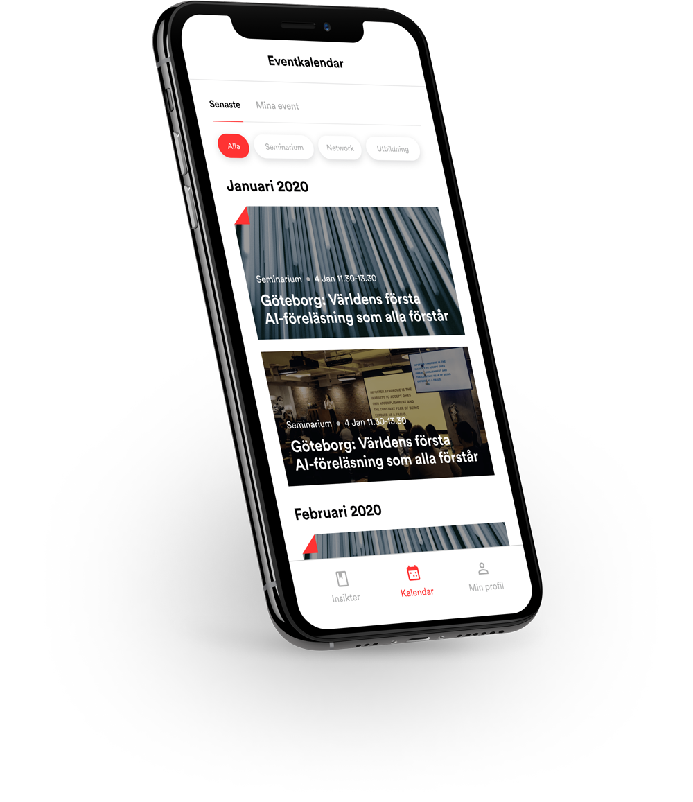
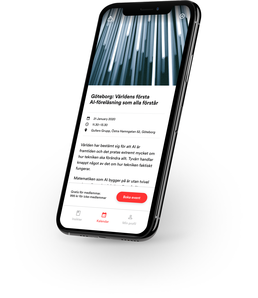
The user is able to filter relevant events and book them through the app. They are also able to edit their reservation on the go.
High-level concept explorations were done in order to test app features where the user can:
・interact with the articles in a quick way
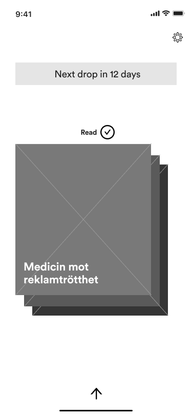
・see the reading status of the article: unopened / in progress / completed, in order to jump back in when needed
・get an overview of their reading habits: see how many articles are missed or in progress since they have downloaded the app
・access archive of all articles ever published
For the article screen I explored ways to showcase the reading progress of each item: some options required a more typographic approach, while others preferred an image-heavy treatment. I also focused on the user interaction with the articles, testing scrolling vs swiping.
A swiping approach was chosen at the end, with the possibility to quickly move back and forth between articles by easily previewing the content.
- TESTING AND ITERATING
I worked on high fidelity prototypes to test with both the client and some users. This phase led to some UI tweaks and copy changes, and also helped us define some new items to the app roadmap.
- FEATURE HIGHLIGHTS
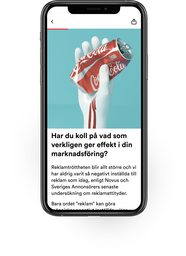
The user can easily see the article reading time and have a quick overview of how many articles they have read.
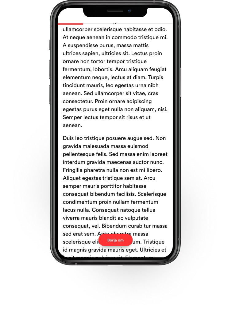
A "start over" function welcomes back the user who had previously closed the article - this allows them to quickly start over if necessary.
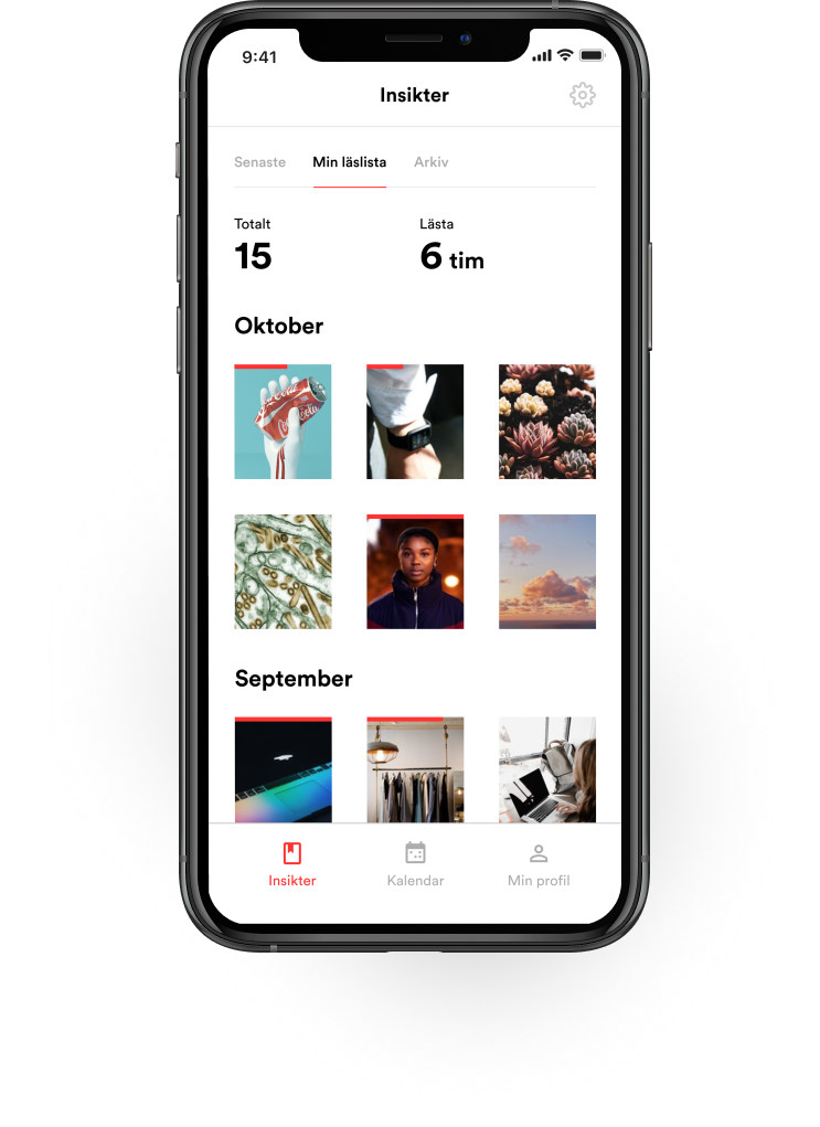
Appreciated functions are the reading status screen and the archive. Reading status is a dedicate space where the user can follow-up their reading habits: articles that have been read and the ones that are unfinished. This simple overview lets the user keep track of what they have missed, making sure they are up to date with the current affairs within the advertising world.
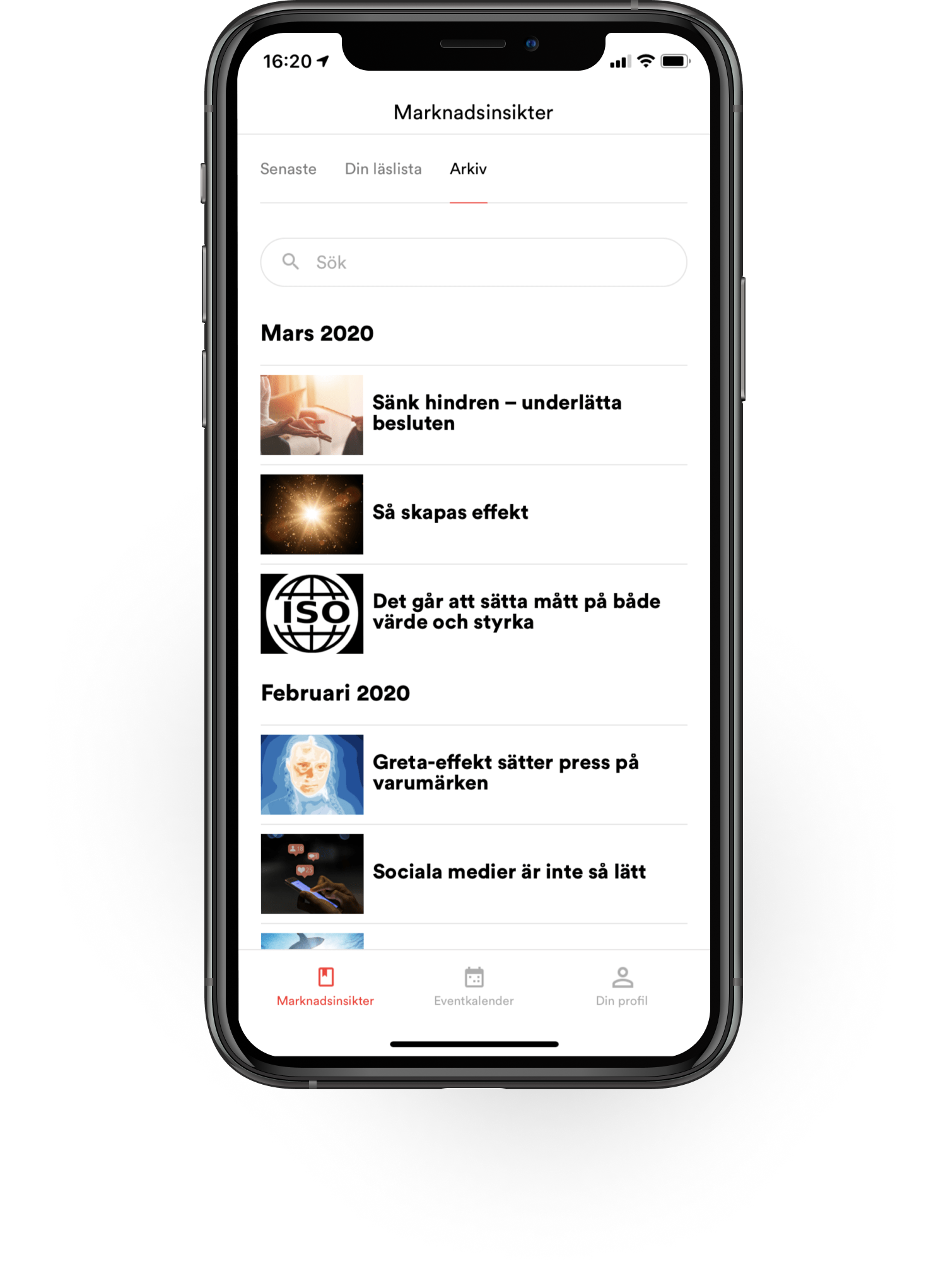
The archive has a very different role: the user voiced the need for a dedicated space where to look for a specific subject, or for an article published long before their membership started. This screen helps with just that.

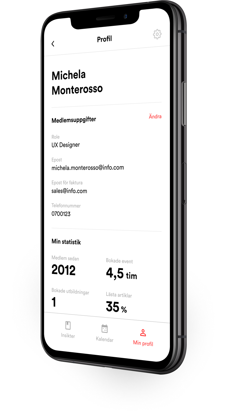
Finally, a personalised profile view presents relevant statics about user activity and engagement with the app and Sveriges Annonsörer.
OTHER PROJECTS
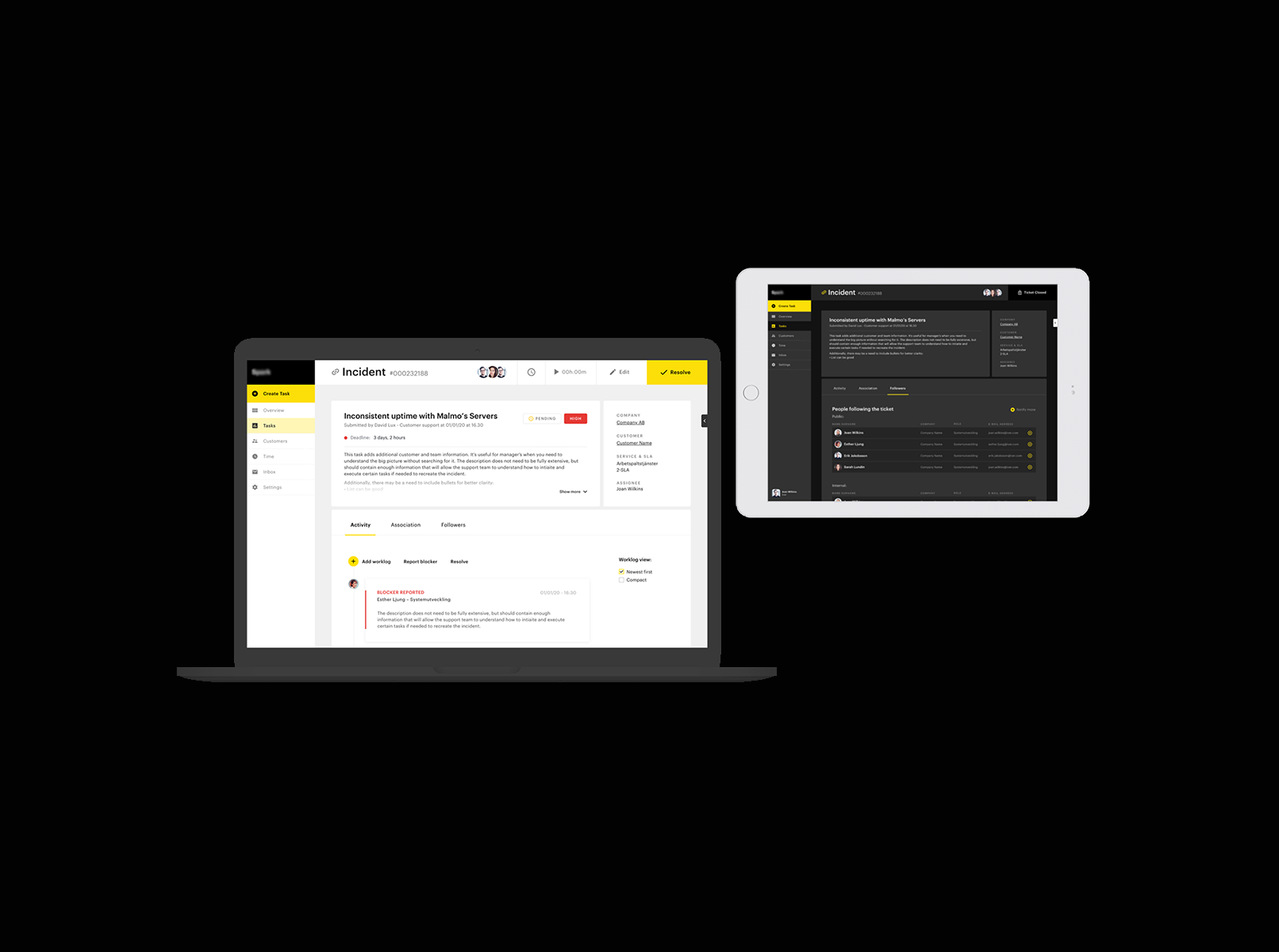
Ticketing support systemProduct design

PartsrådetUX design
EigenbrodtUX design

ShapesUX design

ArchivePast design projects
A work in progress site built with love and occasional anxiety.
A work in progress site built with love and occasional anxiety.
Get in touch:michela.monterosso@gmail.com