Undisclosed client - UX & Product design
Project:
Designing a tailored ticketing system
A gentle reminder for those who forget about the joys of life.
The project scope was to redesign and improve selected screens for a new ticketing system used by one of the major IT providers in Sweden.
01 - Role & responsibilities
My role was that of UX and UI designer on the team, working along with a UX lead and a visual designer. I worked primarily with user research and interaction flows, testing new design components. The main goal of this project was to give our client's product team a solid base to continue developing their own ticketing system.
Main challenges were:
・Create a system that merges qualities of other ticketing softwares already in use by IT support
・Improve structure and flows in order to make the ticketing action faster
・Design screens to reduce human error, by simplifying and clarifying
02 - Process
This project consisted of two sprints, each two weeks long.
During the first sprint I worked with gathering data through user research, interviews and shadowing. In the second half of the process, I worked with creating wireframes, screens, and prototypes to test new flows.
The client's product team and I were in daily contact through Slack, brainstorming and developing the product by joining forces.
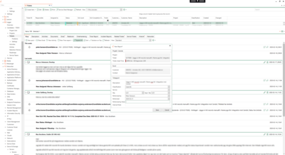
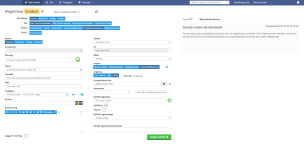
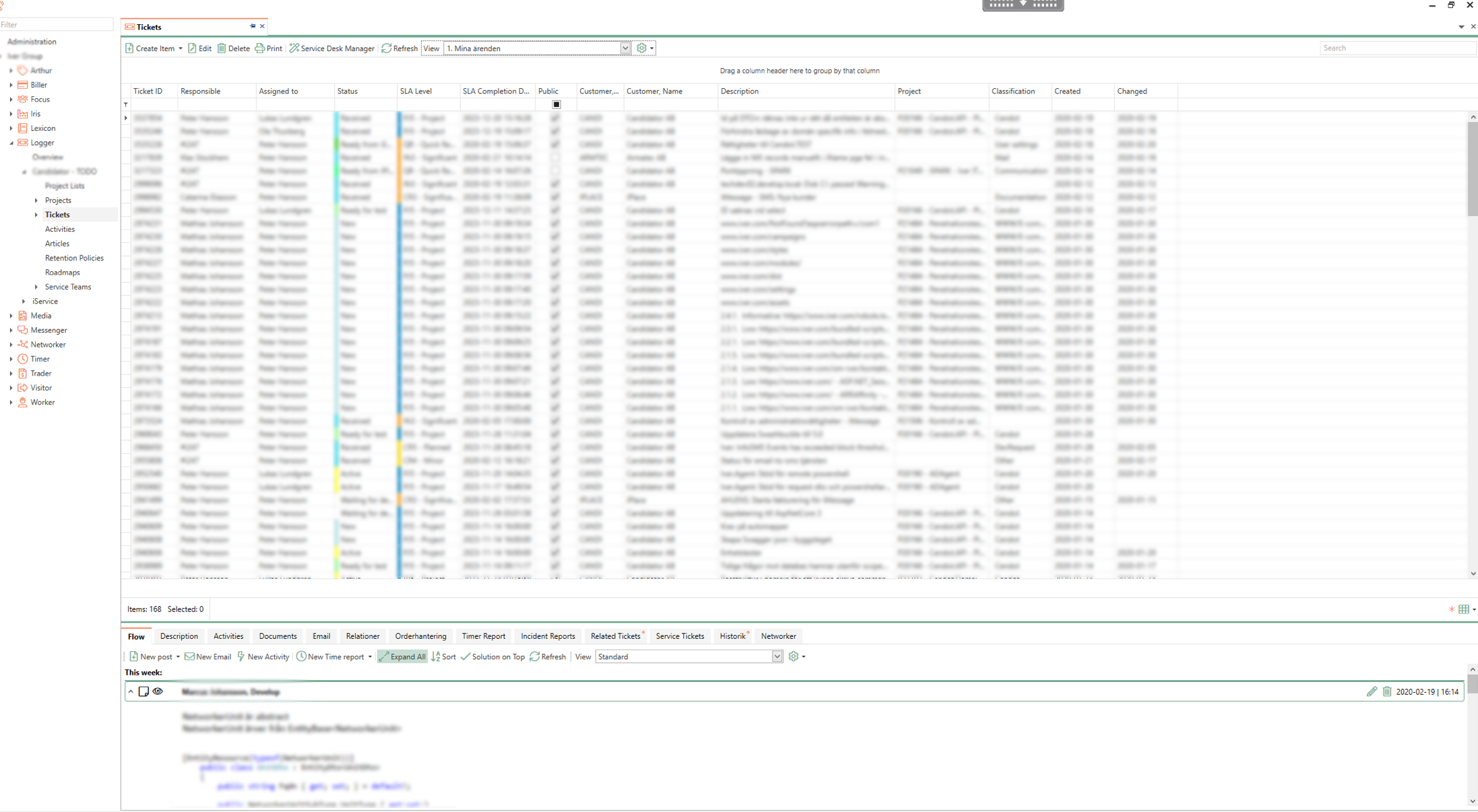
- A DEEP-DIVE INTO THE CURRENT SYSTEMS
Interviews and step by step reviews of the two ticketing systems in use by the different teams. With each interview, I annotated pain points and needs of the the users, in order to understand the different needs based on role: What is the most important feature for front-line IT support? What about a manager? With this in mind, I collected material to then analyse and prioritise features together with the client (who was also the user base)
- BRAINSTORM AND SKETCHING
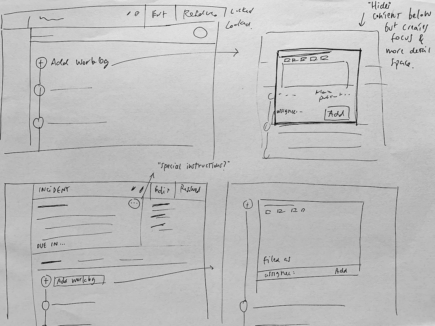
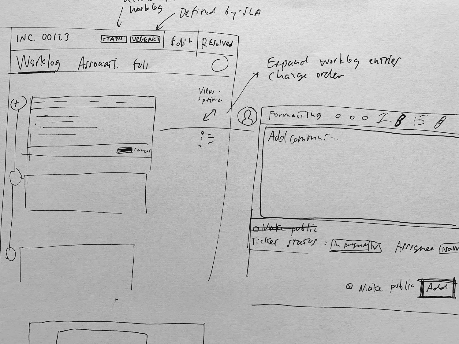
Paper-based sketches are still one of my favourite tools. As with most of other projects, here too I worked extensively on paper first and then shared these initial sketches with the team. Flows were also tested this way, together with alternative routes.
- DESIGN & FLOWS
The system was a complex one, with a multitude of interactions and different instances depending on the user choice. Here I highlight some screens and features I worked with.
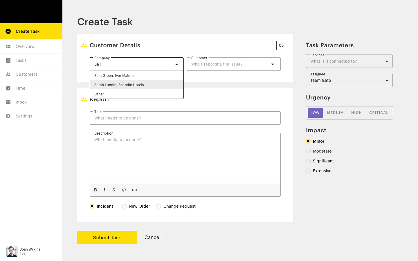
Creating a ticket
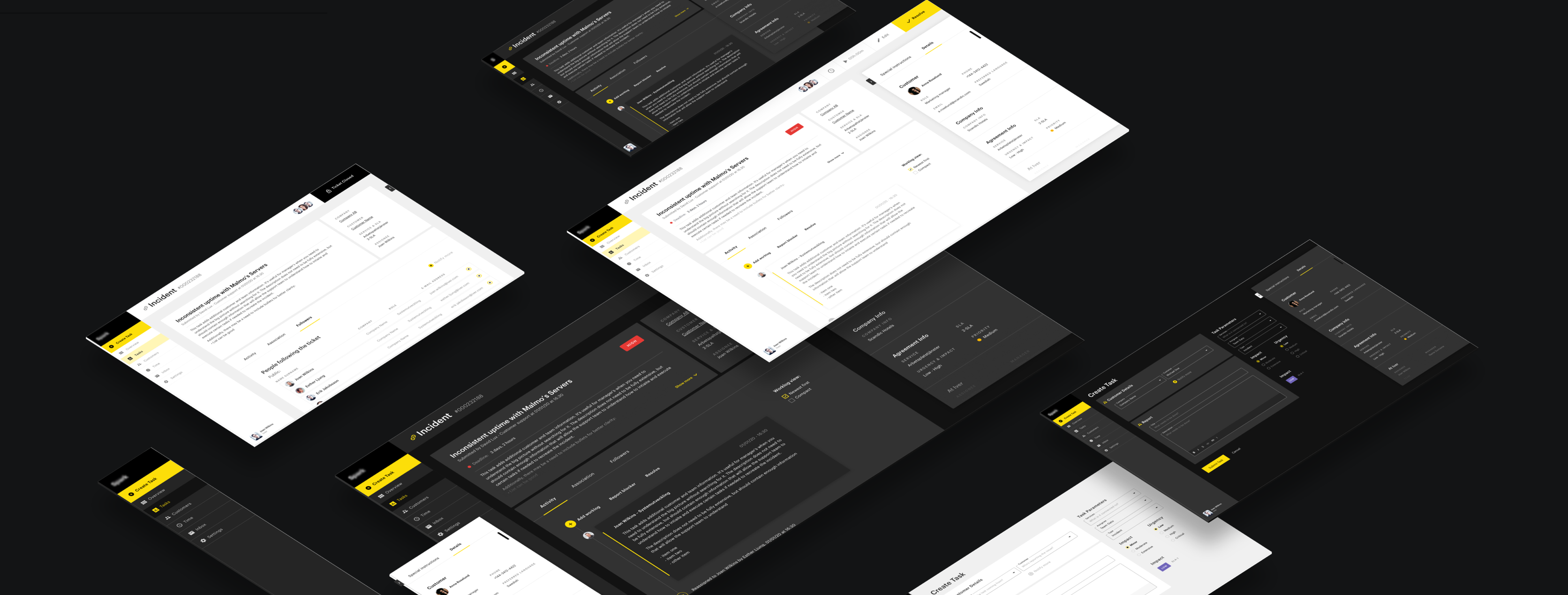
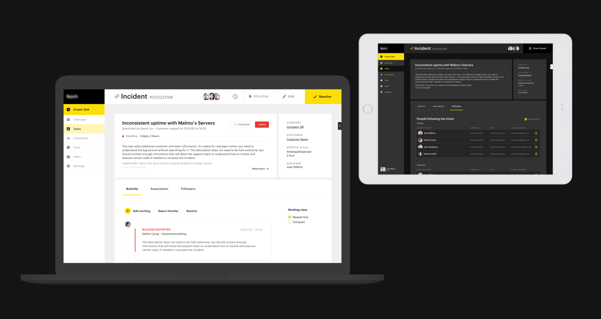
Redesign of the main view for faster ticket creation. In collaboration with a visual designer, I worked with colour and content hierarchy to balance the importance of the items at each step.
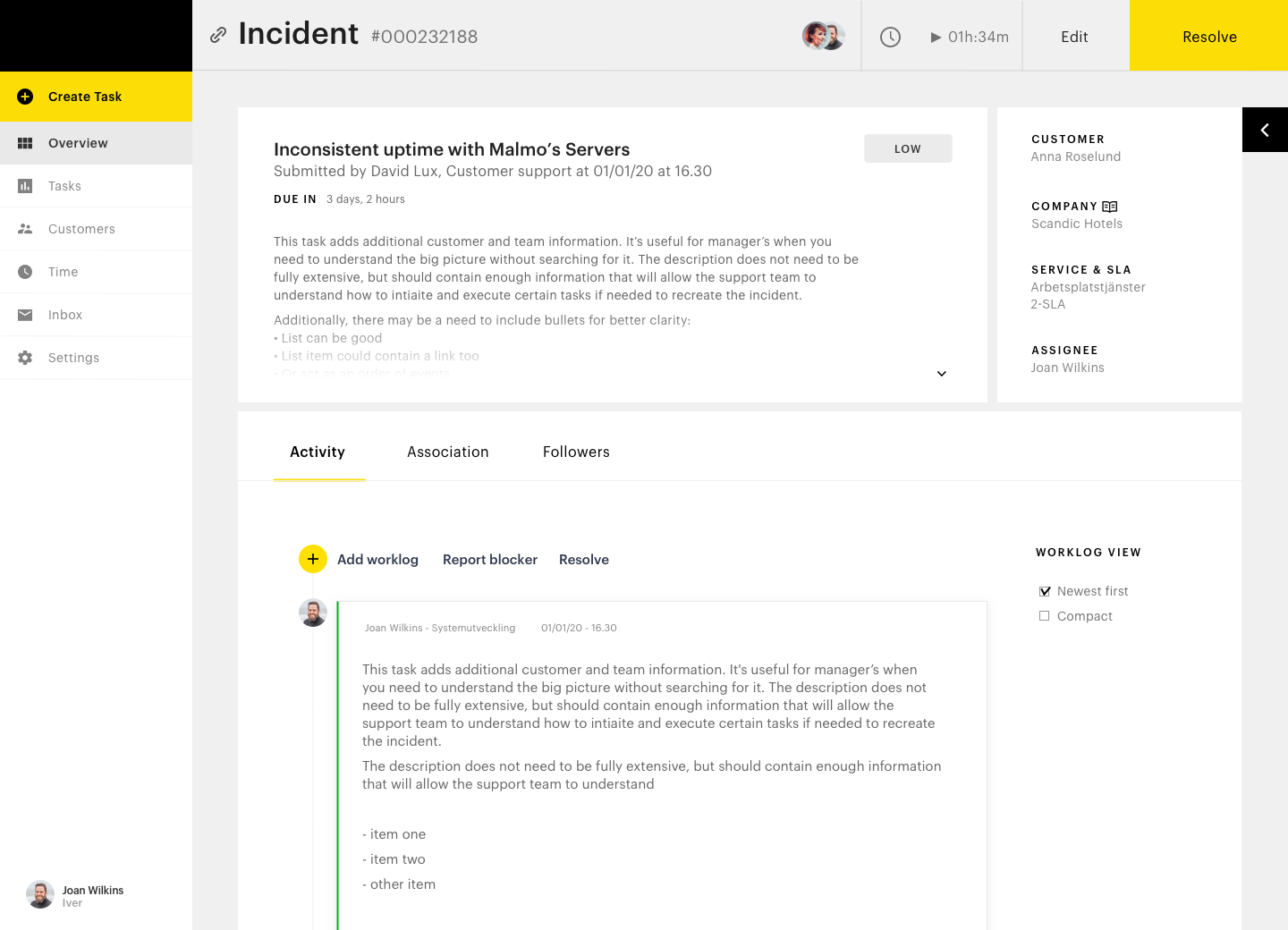
Open and resolve ticket
Here I introduced a modular view and worked with content structure and interactions: for example how to open or expand views, how to reveal and hide content.
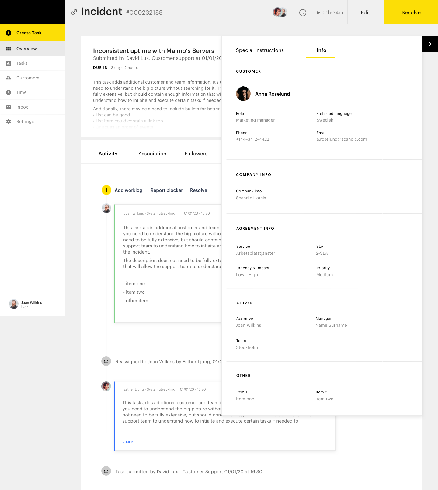
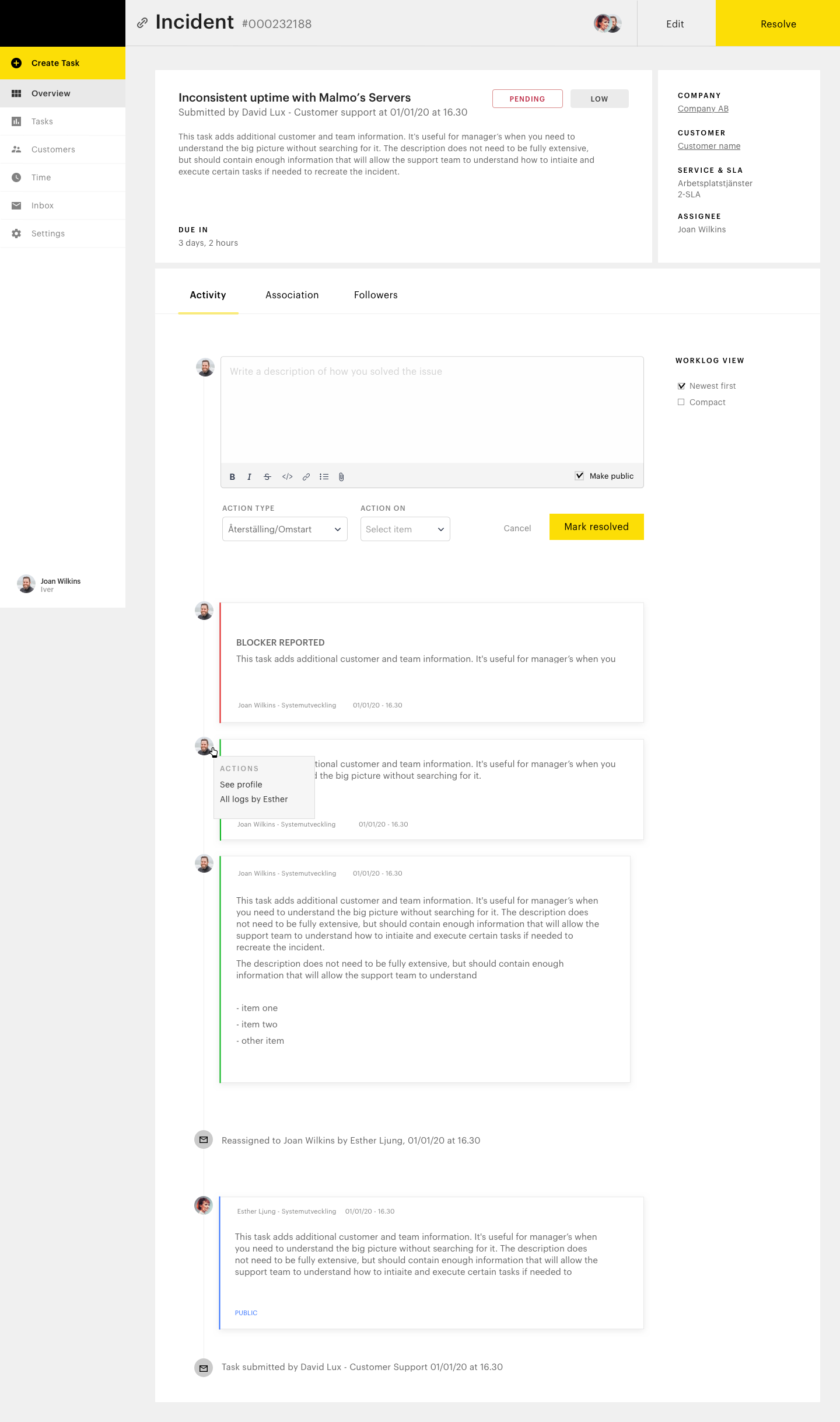
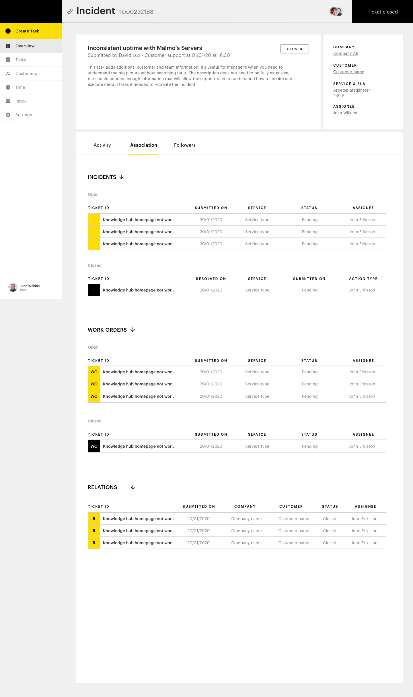
Work with the ticket
Here I ideated and worked with tabs, timeline design, and interactions and status updates.
03 - Result
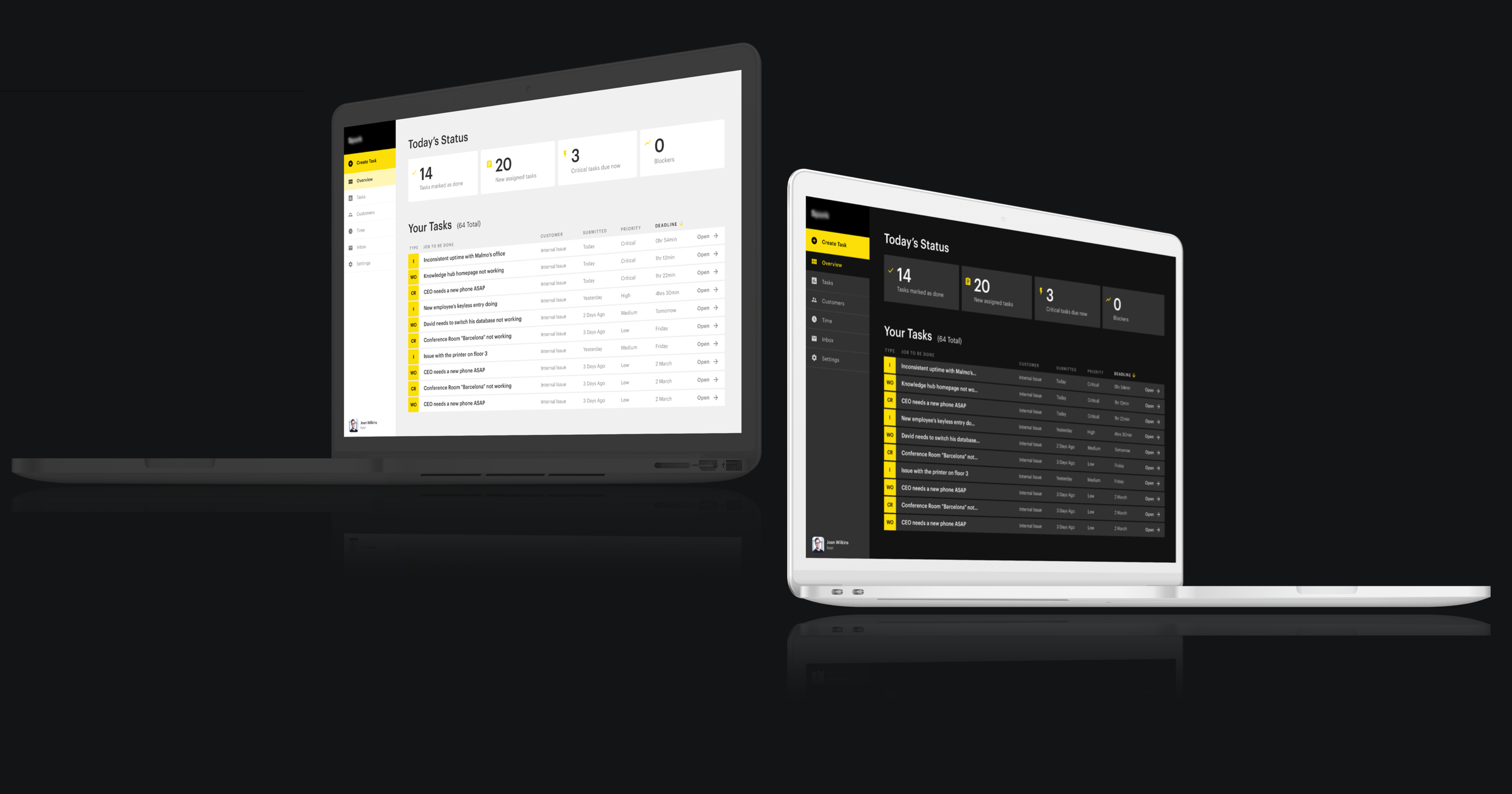
The two sprints landed in the final design of the most vital screens, also adapted for different viewports. A dark mode was also made.
OTHER PROJECTS

PartsrådetUX design
SA appProduct design
EigenbrodtUX design
ShapesUX design
ArchivePast design projects
A work in progress site built with love and occasional anxiety.
A work in progress site built with love and occasional anxiety.
Get in touch:michela.monterosso@gmail.com