We Plus - Product design
Project:
Creating an inspiring and welcoming wellness product
A gentle reminder for those who forget about the joys of life.
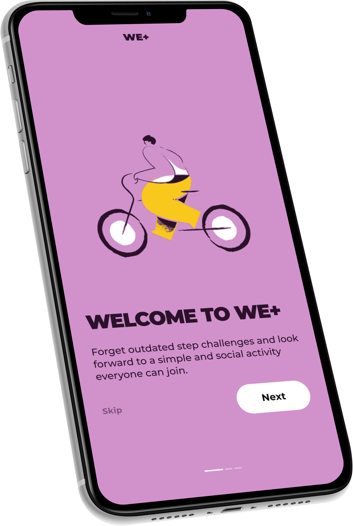
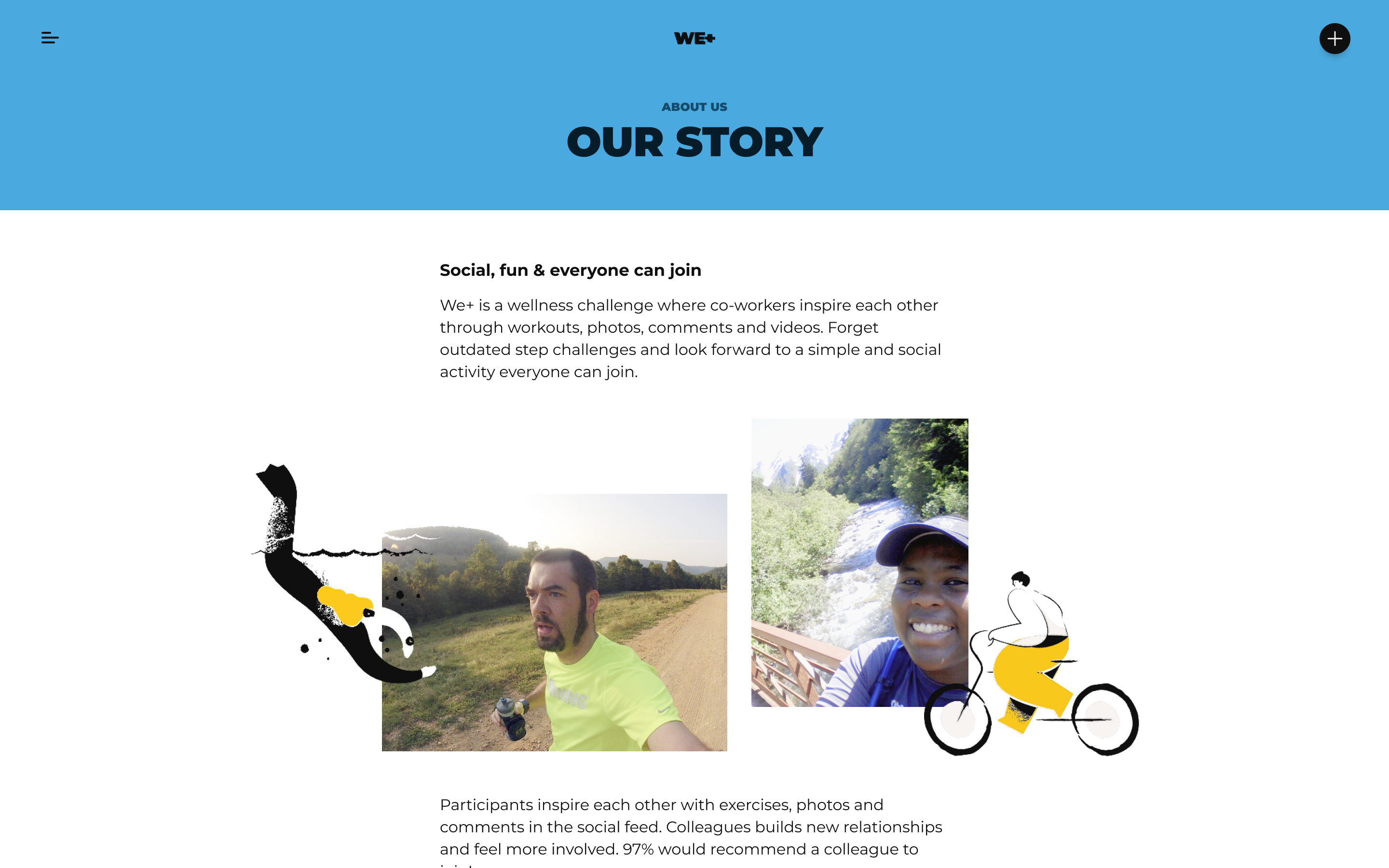
We+ is a wellness web app where co-workers can challenge and inspire each other through workouts, photos, comments and videos.

01 - Role & responsibilities
As UX and UI designer on the team, I worked closely with a visual designer, drafting and testing flows and new ways of interacting with the product. I also designed some core assets and supported with expanding the design system of the app. Our tight team held weekly check-ins with the client, and almost daily sessions with their developer.
02 - Process
- ALIGNEMENT
This project was a 2-week sprint, making it one of the fastest - yet most fun projects I´ve ever worked on. The initial request was to simply redesign the app, but upon further investigation and testing we soon realised that a simple change in look wouldn't do: other than a new branding we focused on some key screens and optimised not only their flows, but also their accessibility and clarity.
Upon gathering user data, we soon aligned with the client and embarked on our mission to make the app more:
・intuitive
・welcoming
・relevant
- FINDING FOCUS
Together with the client we framed a list of high-priority flows to tackle, which can be summarised in these challenge questions:
・How can we create a faster and more enjoyable "add activity" flow?
・How can we inspire the user to explore their colleagues' activities?
・Can we clearly structure content without overwhelming the user?
- A NEW CONTENT STRUCTURE AND FLOW
With our key challenges in mind, I explored several flows, interactions, and design directions, in close relation with the developer.
Chosen updated screens for this case:
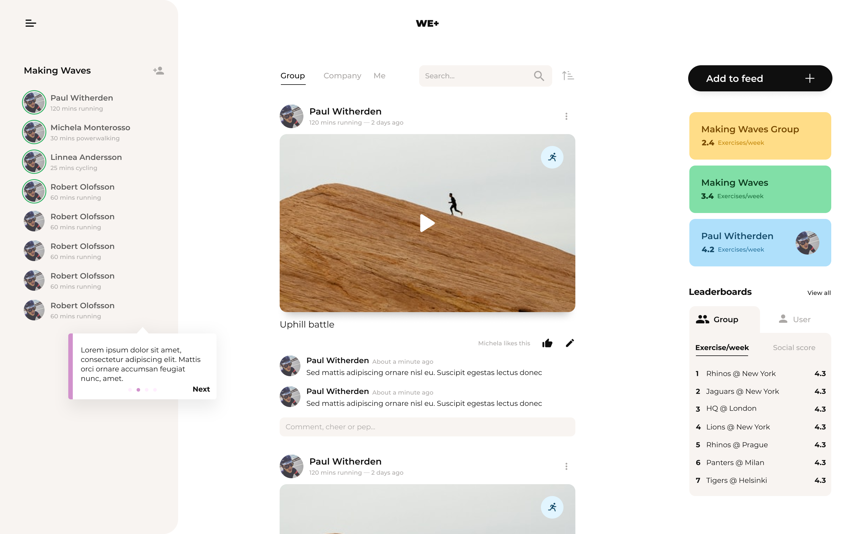
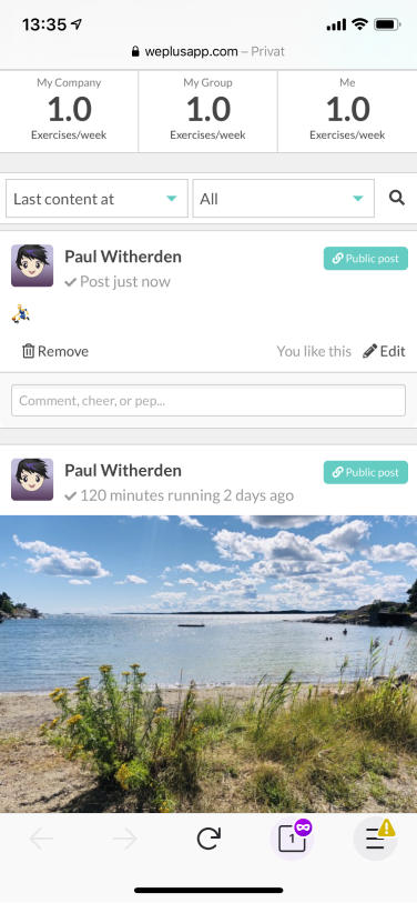
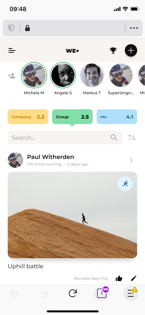
Home feed
The biggest overhaul in the app: from a simple list of activities, this screen grew richer in content and inspiration.
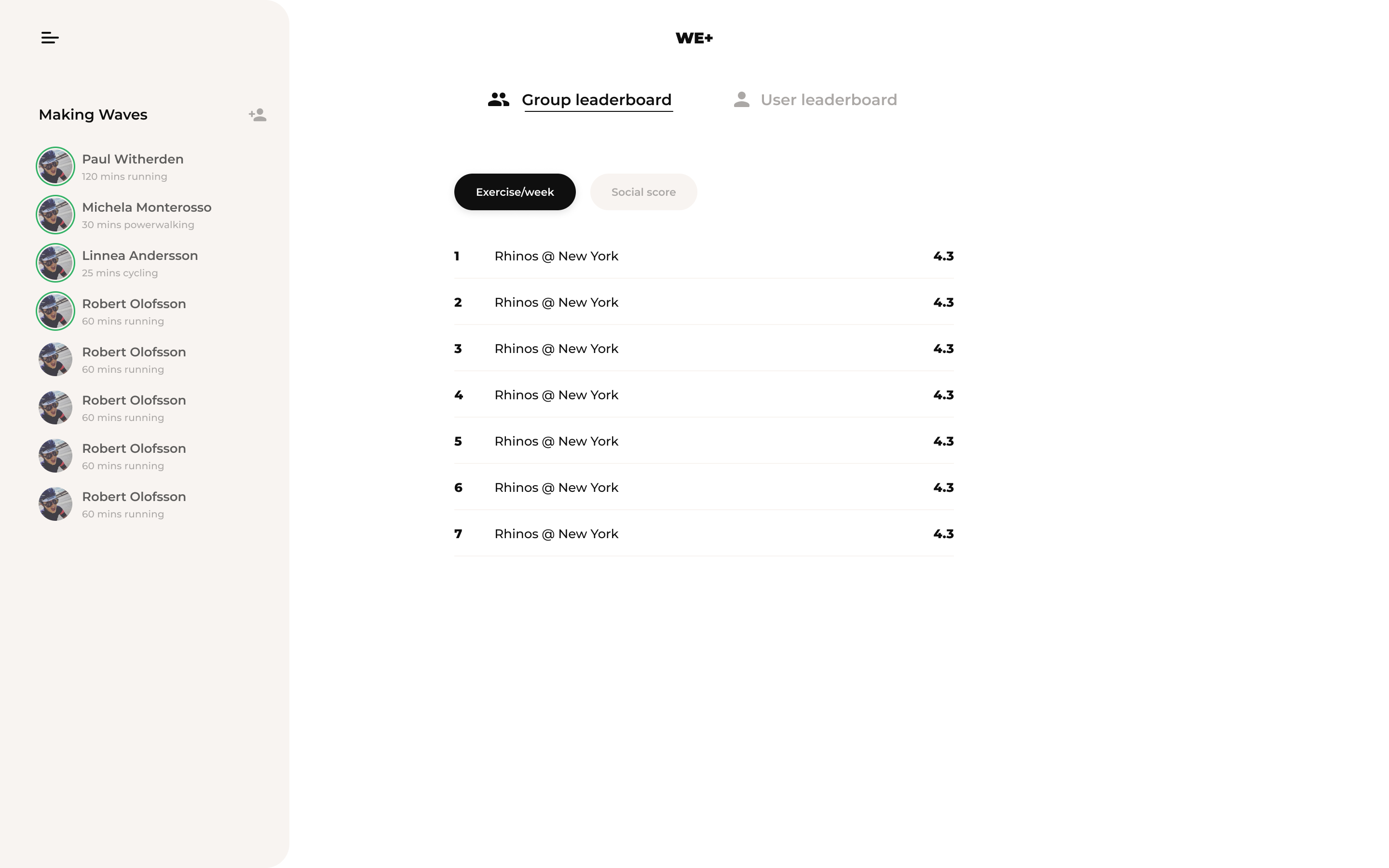
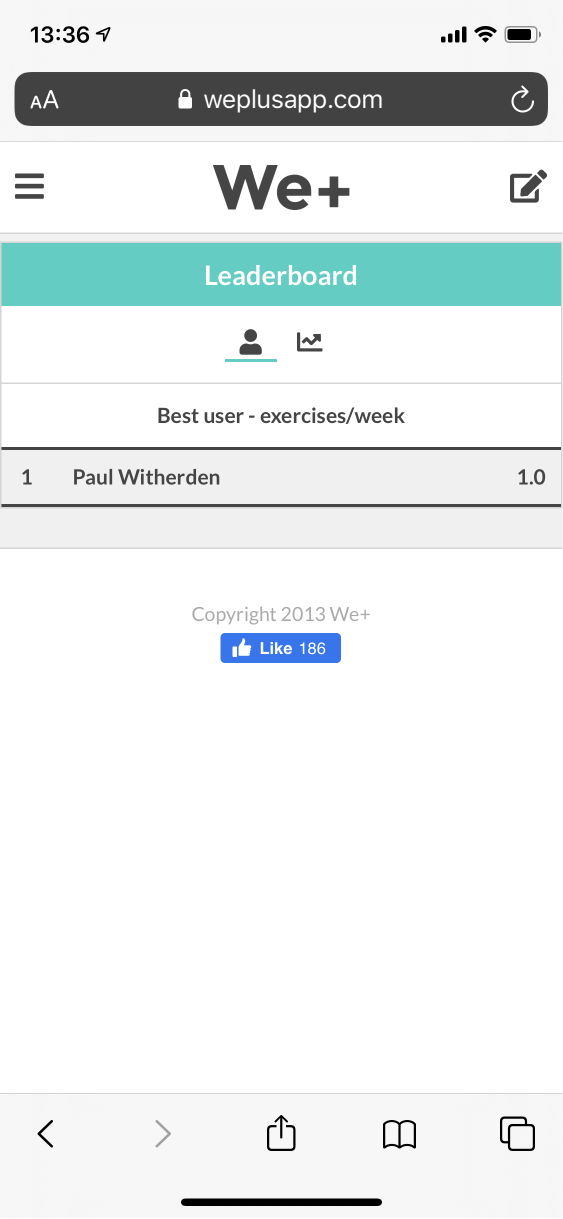
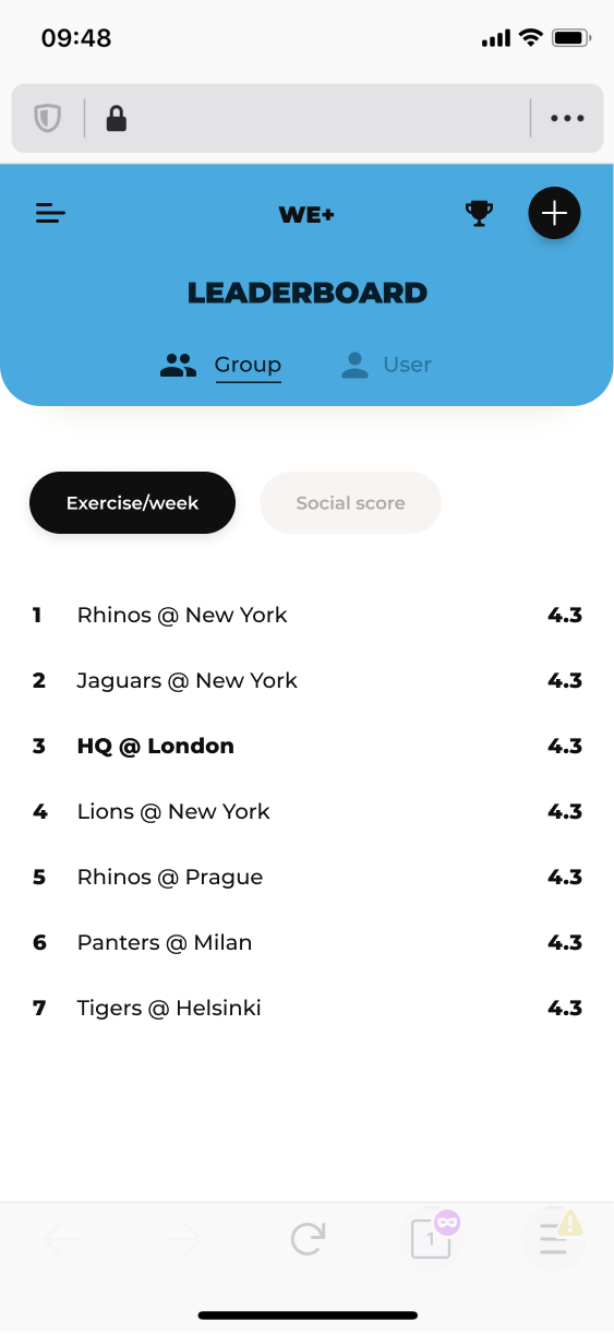
Leaderboard structure
I worked on creating a better experience to access all the different leaderboards
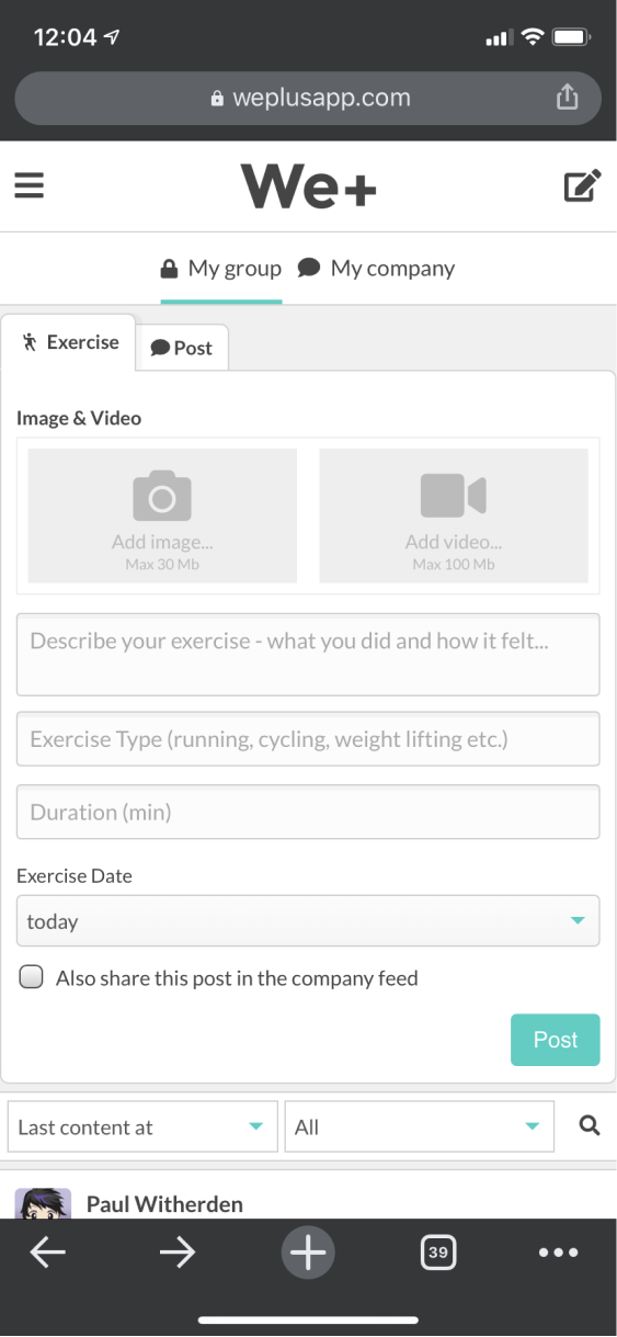
Add activity
I explored ways to create a more intuitive and faster way to upload an activity
03 - Result
Home feed
I iterated and tested ways to show team members across the user's own team, company and/or division.
Explorations included ways to:
- show online and offline users
- quickly toggle between team and company feeds
This screen was particularly challenging: stakeholders wanted to introduce features that were hard to work with considering our viewport, and at the same time we wanted to make this view as inspiring as possible, showcasing interesting content and interactions
Some examples of screen explorations.
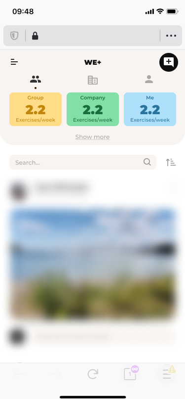
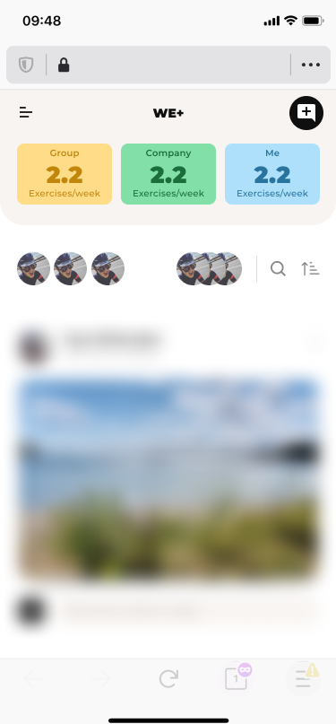
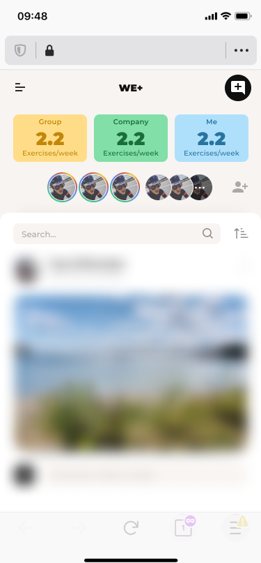
Home feed
I iterated and tested ways to show team members across the user's own team, company and/or division.
Explorations included ways to:
- show online and offline users
- quickly toggle between team and company feeds
This screen was particularly challenging: stakeholders wanted to introduce features that were hard to work with considering our viewport, and at the same time we wanted to make this view as inspiring as possible, showcasing interesting content and interactions
Some examples of screen explorations:
Leaderboards
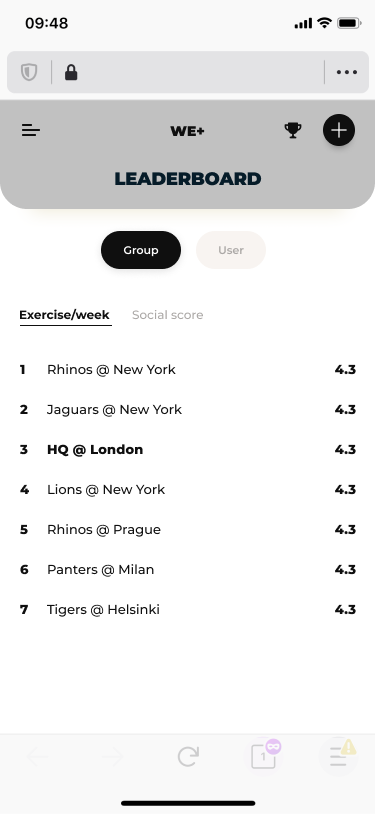
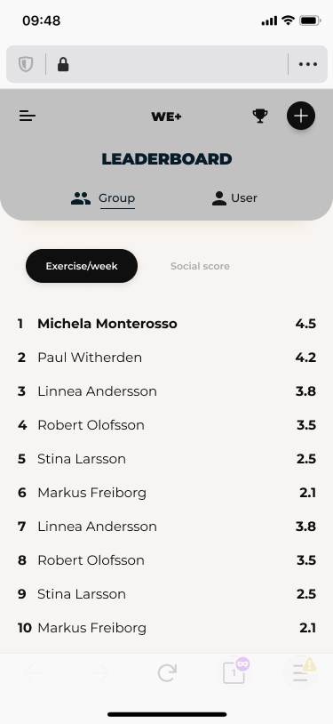
I worked on improving the leaderboard screen, testing ways to toggle between sections both on mobile and on desktop.
Some examples of screen explorations.
Leaderboards
I worked on improving the leaderboard screen, testing ways to toggle between sections both on mobile and on desktop.
Some examples of screen explorations:
Add activity
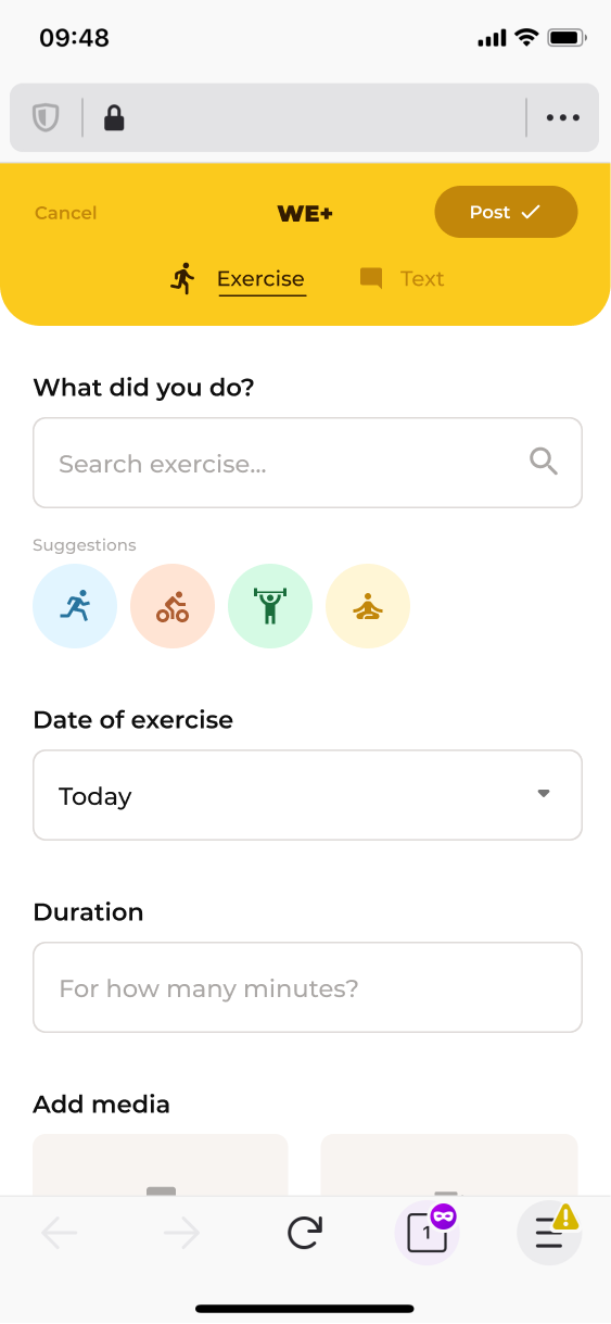
Adding a workout on the current design tested to be slow, with several users complaining about data input. Here I worked on creating a smoother experience, adding a "recent activity" quick selection. I focused also on the overall visual experience, shuffling content blocks and creating a more friendly design.
EXPANDING THE DESIGN SYSTEM
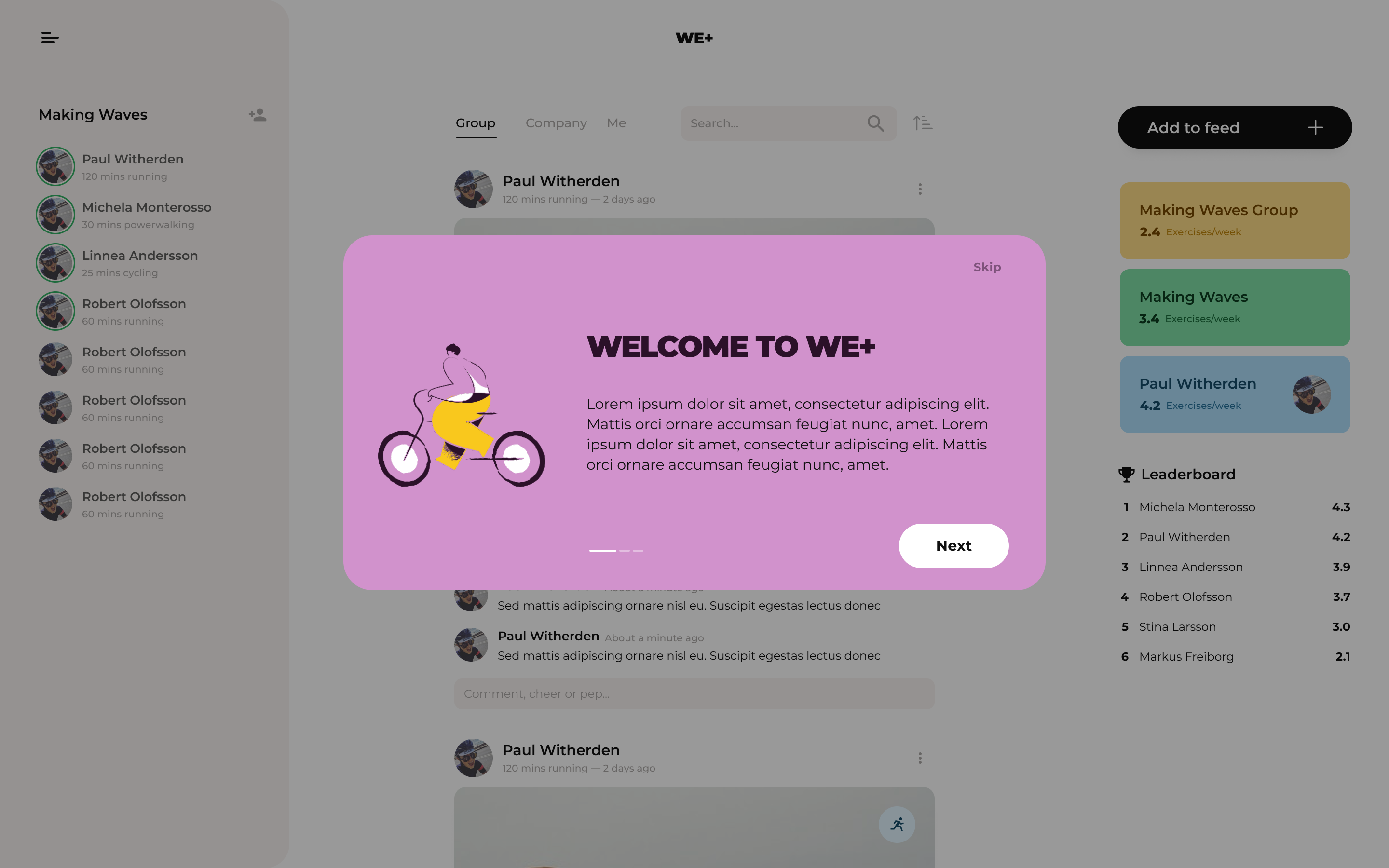
The main screens were then translated into a desktop view, requiring new hierarchy and visual explorations.
Before and after
Move the slider right and left to see the design changes.
Before and after
Move the slider right and left to see the design changes.

OTHER PROJECTS
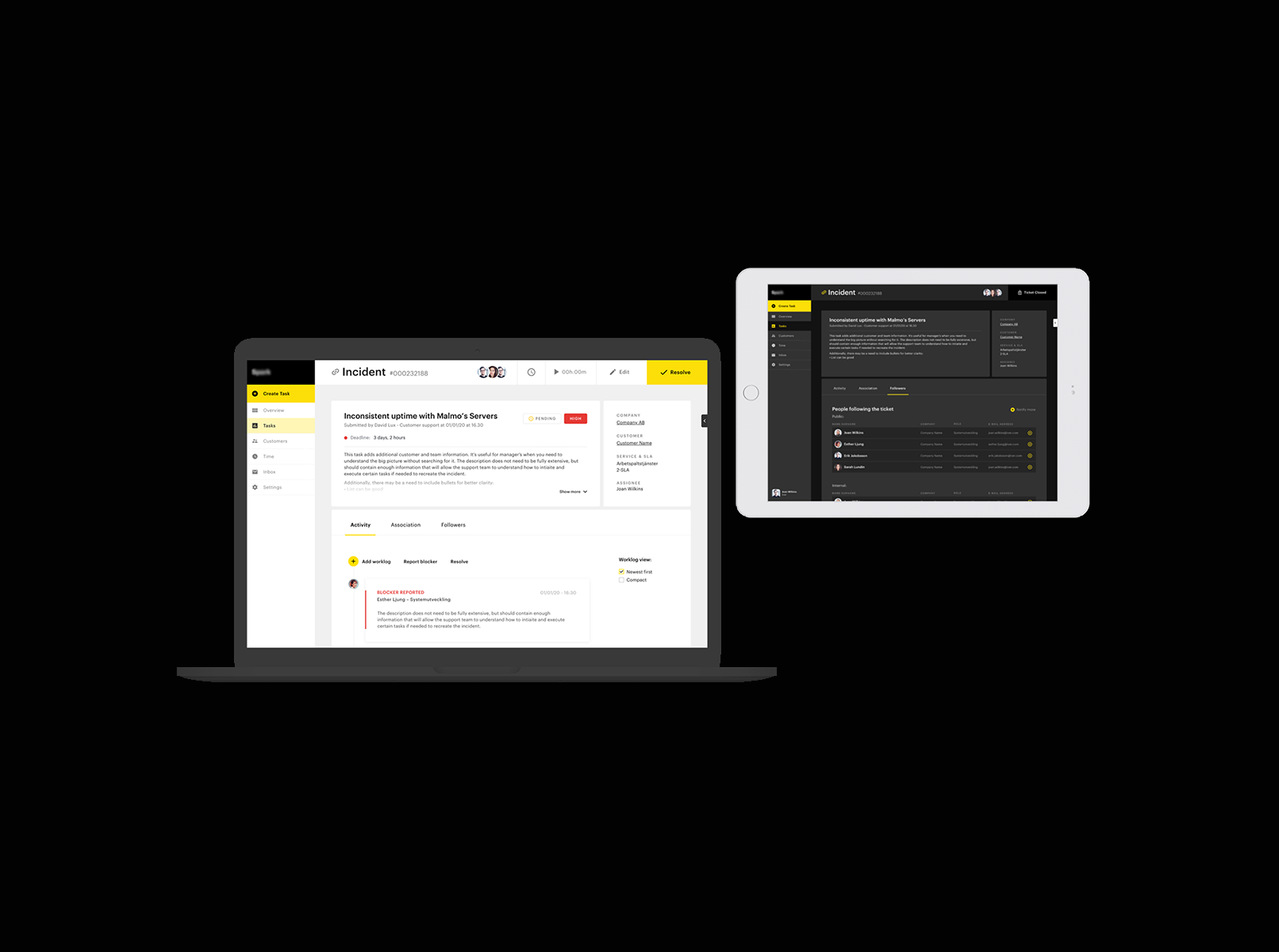
Ticketing support systemProduct design

PartsrådetUX design
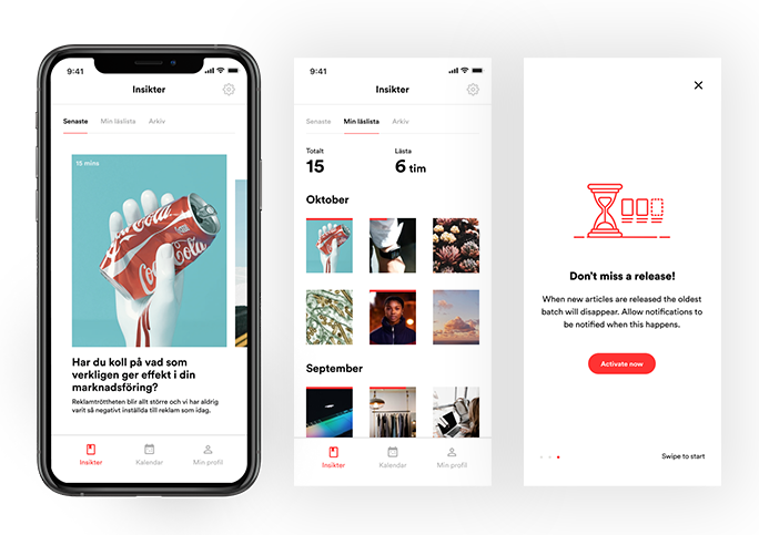
SA appProduct design
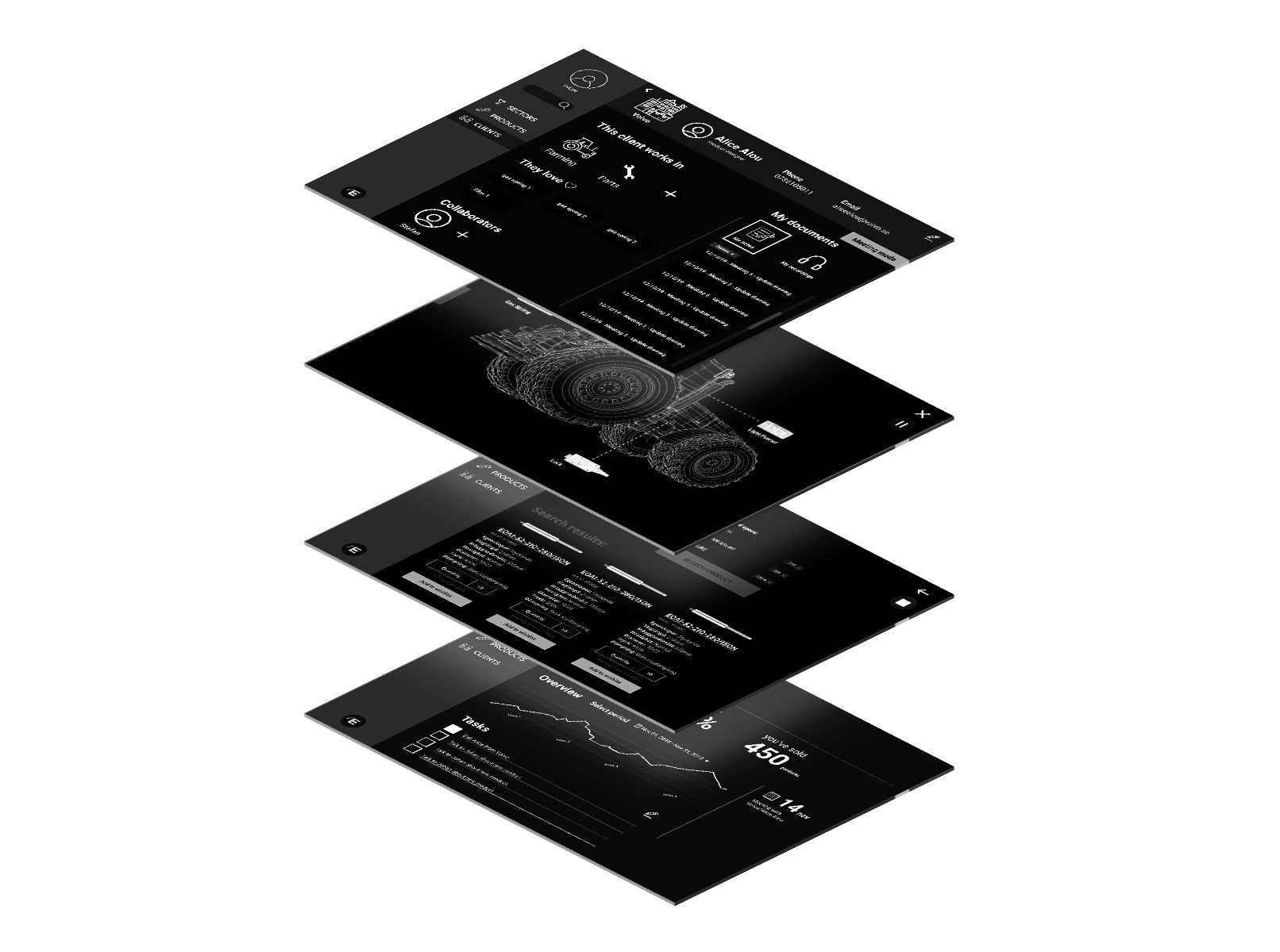
EigenbrodtUX design
ShapesUX design
ArchivePast design projects
A work in progress site built with love and occasional anxiety.
A work in progress site built with love and occasional anxiety.
Get in touch:michela.monterosso@gmail.com